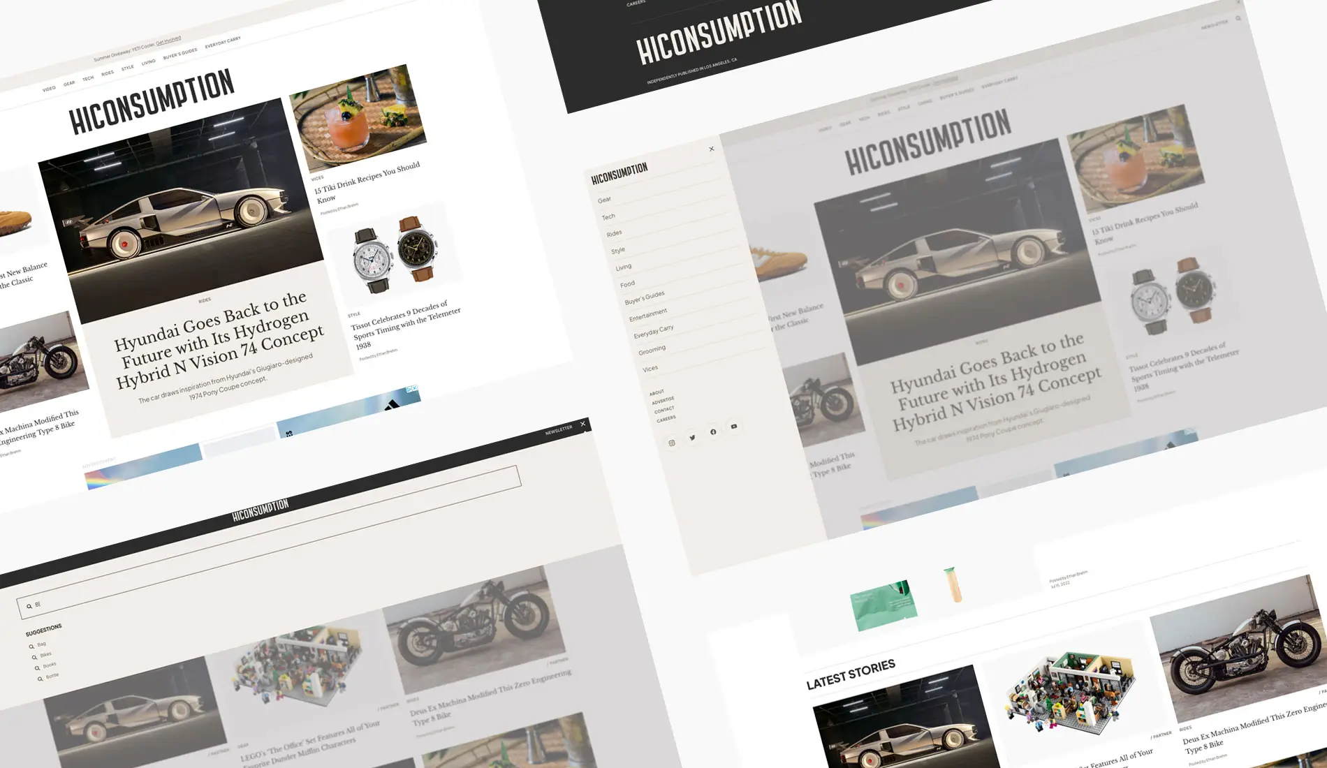
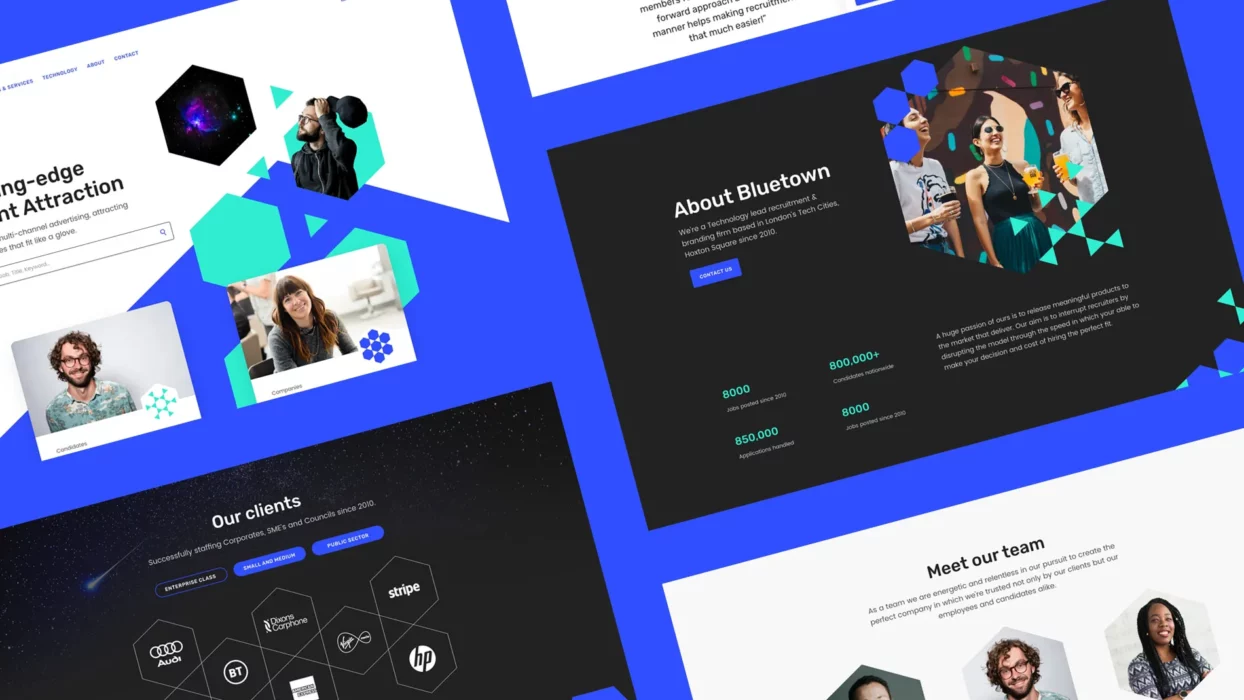
When it comes to creating a successful blog, design is key. An attractive blog design can have a big impact on how easily visitors can find the content they’re looking for and keep them engaged. That’s why it’s essential to make sure that your blog design looks great.
With over 16 years of experience designing blogs for niche markets, we’ve built magazines in different verticals, from men’s lifestyle to gardening and holiday destinations.
When clients come to us, we’re always asked how we’ll make their blog look better while increasing revenue. Because every blog has its niche and style of writing, that’s not always easy to answer, but as long as we follow our guiding principles in UX and UI design and lean on our experience from creating successful blogs, we can almost guarantee growth so long as the content is good. Our expertise has helped some clients to sell their blog designs for five- and six-figure sums within 12 months of the re-design.
To give you some inspiration, in this blog post, we’ll look at 10 of the best examples of beautiful blog design, explore tips on what makes a great blog, and discover the best platforms to get you off to a winning start.
Choosing the best blogging platform
Before diving into creating a beautiful blog design, you must decide on the platform you’ll use. The platform you choose will determine the flexibility and functionality of your blog, so it’s an important decision to make.
WordPress is the most popular choice and is what we always build on. With its user-friendly interface and a vast library of plugins and free themes, WordPress allows a web design agency like ours to create customised themes for your blog design. Whether you want a minimalist layout or a more elaborate design, WordPress and our design team’s vision have the tools to make it happen. Free themes are great for starting out, but a customised theme will set you apart.
Another option is Blogger. Owned by Google, Blogger offers a simple and intuitive platform for creating and managing your blog. It may not have as many customisation options as WordPress, but it’s a good choice if you are testing the waters and want a straightforward, hassle-free blogging experience while you keep things simple.
Ultimately, the platform you choose should align with your goals, preferences, and level of expertise. Take the time to explore your options and choose the platform that best suits your needs for a successful and visually appealing blog design.
How to create a killer blog
What sets apart a killer blog from the rest? It’s not just about having a visually appealing design but also about delivering exceptional content and providing value to your readers. A killer blog engages and captivates its audience, leaving them eager to return for more.
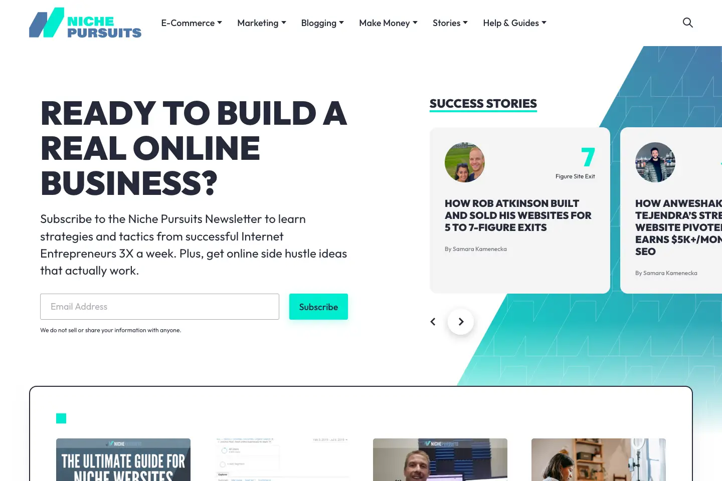
First and foremost, a killer blog must have a clear and defined niche. It’s important to know who your target audience is and what they are interested in. By focusing on a specific niche, you can provide more targeted and valuable content that resonates with your readers. Our friends and client, Niche Pursuits, have nailed this journey and created a resource around building niche blogs. Check out their articles here.
Another crucial aspect of a killer blog is the quality of its content. Your blog posts should be well-researched, informative, and engaging. It’s important to offer unique insights and perspectives that set you apart from the competition. Remember to keep your writing style conversational and relatable, as this helps to build a connection with your audience.
In addition to great content, you should also pay attention to SEO. Optimising your blog posts with relevant keywords can help improve your visibility in search engine rankings, attracting more organic traffic to your site.
Lastly, a killer blog understands the importance of engaging with its readers. If your content and growth plan allows, why not encourage comments and feedback, and respond to them promptly? Building a community around your blog fosters a sense of belonging and helps establish your authority and credibility in your niche.
Designing a winning blog
Many online blog designs have been created with a free theme. They look like clones of one another, and it can be hard to distinguish between competitors. We only design and build custom blog designs in WordPress to set our clients apart. Yes, all themes have a similar DNA; after all, there are best practices to follow, but applying a brand to the page layouts and content sets you apart. That’s where you need professional help.
Grab their attention with the homepage
A stunning homepage is your blog’s first impression on visitors, so it’s essential to make it count. Your homepage should capture the essence of your blog and entice readers to explore further.
One key element of a stunning homepage is a visually appealing and well-designed layout. Don’t just list your articles in a grid; break it up. Use eye-catching images, bold typography, and vibrant colours to define areas and grab your readers’ attention.
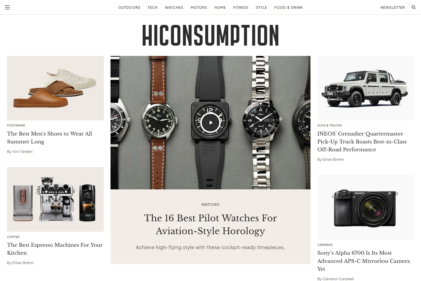
Consider incorporating a Featured Posts and Editor’s Picks section. Place these in containers like a slider or in columns to break up the page and showcase your best content. This will draw readers in and ensure your homepage is easy to navigate, with clear categories or sections that guide readers to the content they’re interested in.
Remember, your homepage sets the stage for the rest of your blog, so make it stunning and captivating to keep readers engaged.
Effective navigation
Effective navigation is essential for a successful blog design. When visitors come to your blog, they want to easily find the content they’re looking for without getting lost or frustrated. That’s where effective navigation comes in.
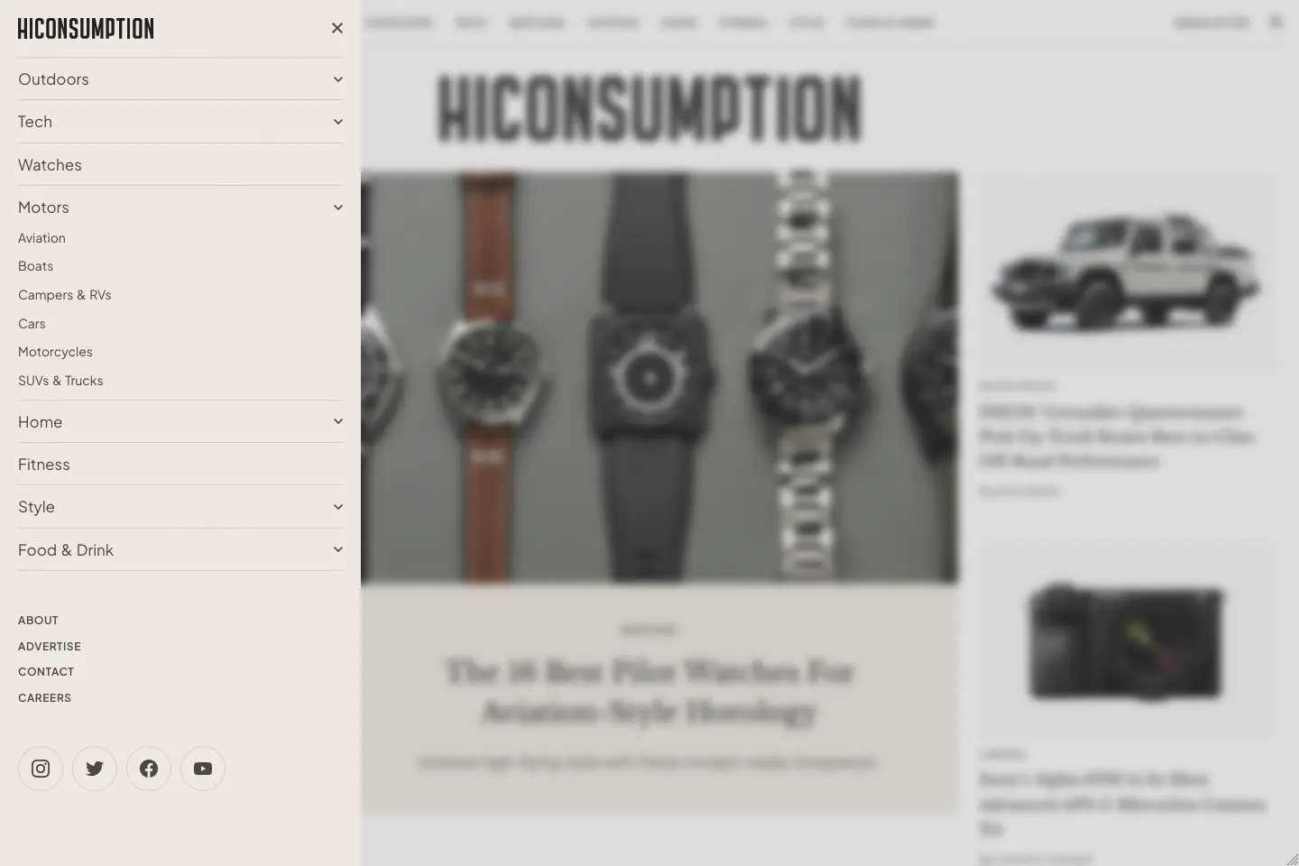
To ensure your blog has effective navigation, there are a few key elements to consider. First, your menu should be straightforward and intuitive, with categories and subcategories that make sense for your content. Ensure your menu is prominently displayed and easy to find on every blog page. If you have a lot of parent categories, and you want to show them all, why not consider a hybrid nav with a set of exposed links across the top and the rest grouped inside a hamburger menu?
Next, include a search bar to allow readers to search for specific topics or keywords quickly. Why not make it even more effective using a predictive search or suggested search terms? This can be a real time-saver for visitors who know precisely what they’re looking for.
Another important aspect of effective navigation is the use of internal linking. Include links within your blog posts to related content, making it easy for readers to discover more of your valuable content.
Lastly, consider the overall layout and structure of your blog. Make sure it is visually appealing and organised logically, with clear sections and headings guiding readers through your content.
By implementing these strategies, you can ensure that your blog is easy to navigate and provides a seamless user experience for your visitors.
Choose the right fonts, colours and contrast
Fonts, colours and contrast are vital in creating a visually appealing and cohesive blog design. Choosing the right fonts and colours can set the tone and mood of your blog, while contrast helps to emphasise important elements and create visual interest.
When selecting fonts and colours for your blog, consider your brand identity and the emotions you want to evoke in your readers. For example, warm colours like red and orange can create a sense of excitement and energy, while cool colours like blue and green can evoke calmness and tranquillity. It’s also important to consider contrast, the difference between light and dark elements. A high contrast can make your content more readable and draw attention to important elements, while a low contrast can create a softer and more harmonious aesthetic. By choosing the right fonts, colours and contrast for your blog design, you can create a visually stunning and cohesive experience for your readers.
Use lifestyle imagery
To create a visually stunning blog design, consider incorporating lifestyle imagery into your blog pages. Lifestyle imagery is photography that captures the essence of a particular lifestyle or theme. By using lifestyle imagery, you can create a more relatable and immersive experience for your readers rather than graphically designed visuals.
For example, if you have a food blog, you can use lifestyle imagery to showcase delicious dishes. This can help your readers imagine themselves enjoying the food and create a stronger connection to your content. Similarly, if you have a travel blog, you can use lifestyle imagery to transport your readers to exotic locations and inspire their wanderlust.
When selecting lifestyle imagery, make sure it aligns with your blog’s aesthetic and content. Choose high-quality, visually appealing images that reflect your brand and resonate with your target audience. Reject the more cliche and dated image ideas of ‘people shaking hands’, for example.
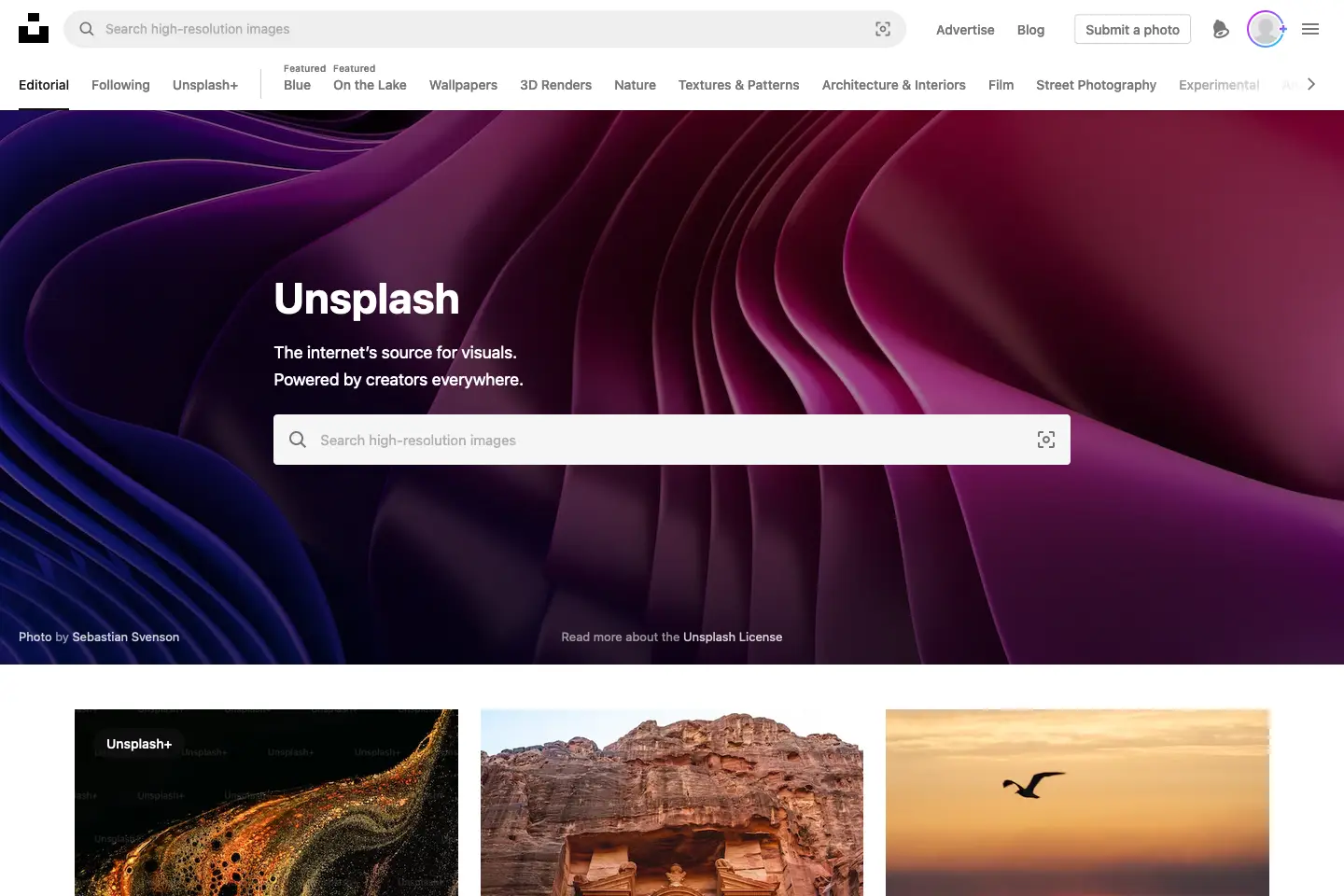
You can source lifestyle imagery from stock photo websites like Unsplash or hire a photographer to capture photos representing your blog’s style. And if your blog focuses on product reviews, you’re probably in luck and will have these sent to you.
Remember, incorporating lifestyle imagery into your blog design can help to elevate the overall aesthetics and engagement of your blog pages. It adds a personal touch and brings your content to life, making it more enjoyable and relatable for your readers. So don’t be afraid to get creative and use lifestyle imagery to enhance your blog’s visual appeal.
Responsiveness
Your blog must be responsive. This means that your blog design should be able to adapt and look great on different devices, such as desktops, laptops, tablets, and smartphones. With more and more people accessing websites on mobile devices, having a responsive blog design is essential to ensure a positive user experience.
A responsive blog design will automatically adjust the layout and size of your content to fit the screen it’s being viewed on. This means your blog will still look great and be easy to navigate, regardless of the device.
A responsive blog design enhances the user experience and has practical benefits. Google prioritises mobile-friendly websites in its search engine rankings, so having a responsive blog design can improve your site’s visibility and attract more organic traffic.
Choose a platform or theme that offers responsive design options to ensure your blog is responsive. Test your blog on different devices to ensure it looks and functions properly. Optimise images and other media to load quickly on mobile devices. By prioritising responsiveness, you’ll create a blog that is accessible and engaging to users across all devices.
Innovative article layouts and features
Innovative article layouts can take your blog design to the next level and make it stand out. While a traditional article layout can be effective, many creative ways can arrange your content and create a unique user experience.
Why not consider custom Gutenberg blocks to break up long-form text content? From comparison tables to pulling products in from shops, custom content blocks can create interest and highlight important information.
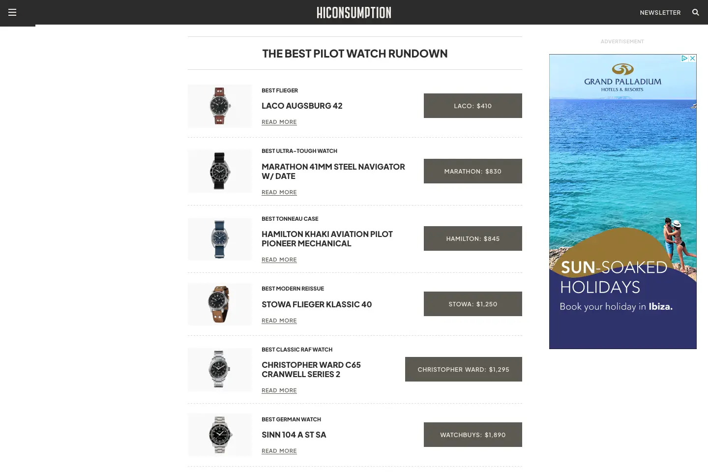
A table of contents for long-form blog articles is a great way to show what’s coming up or help readers jump straight to what they are looking for.
Strategically place advertising from third-party platforms. You could float these down the right-hand side of the article or place them through the content.
Expose multiple authors for a blog post so everyone gets the credit they deserve. And when that content gets updated, let visitors know instead of showing only the original published date.
Show related posts
Once a reader is hooked on your blog, keeping them engaged and encouraging them to explore more of your content is important. One effective way to do this is by showing related posts at the end of each blog post. These related posts are links to other articles on your blog that are similar or relevant to the one the reader just finished.
Showing related posts can have several benefits. First, it helps increase the time readers spend on your blog by giving them more content to explore. This can lead to higher page views and increased engagement. Secondly, showing related posts can help to improve the overall user experience. If readers enjoy a particular article, they may be interested in reading more on the same topic or exploring related subjects. Providing these links makes it easy for them to continue their journey on your blog without searching for similar content.
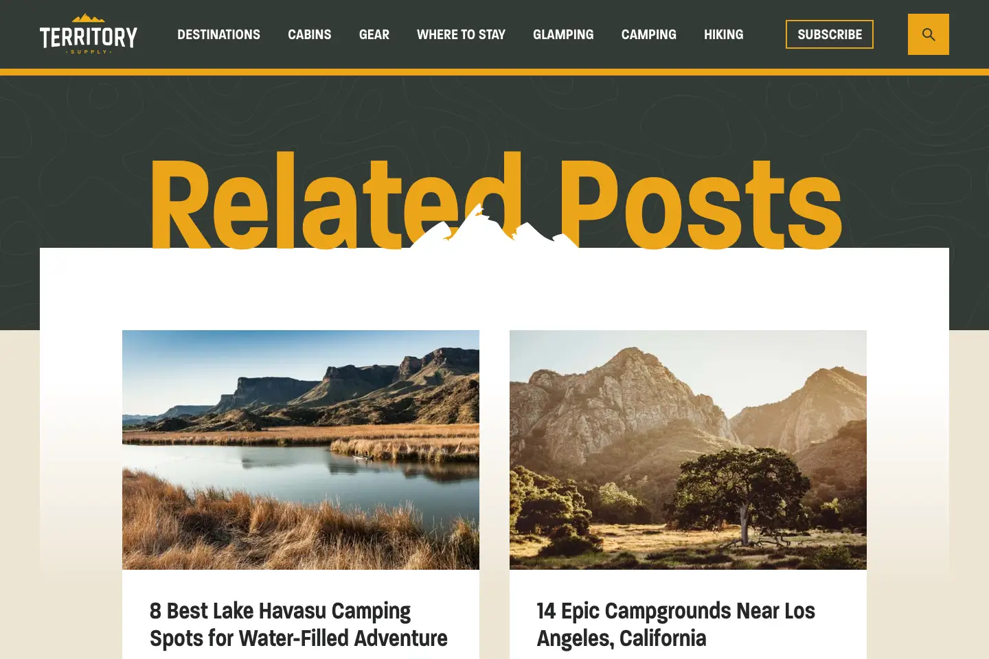
From a passive income perspective, showing related posts can also help to promote your other blog posts and drive traffic to them. Readers who enjoy one article may be likelier to click on a related post and continue reading. This can lead to increased exposure and visibility for your other content.
Overall, showing related posts is a simple and effective way to keep readers engaged and encourage them to explore more of your blog. By providing relevant and exciting content, you can keep readers coming back for more and build a loyal audience.
Add a newsletter signup form
Implementing a newsletter signup form is a valuable strategy to engage with your blog readers and keep them returning for more. By offering a newsletter, you can provide exclusive content, updates, and promotions directly to their inbox, creating a more personalised and interactive experience.
Some of our clients have built huge followings well into the high five figures. You’ll need an email marketing service provider, like Mailchimp or ConvertKit, to implement a newsletter signup form. These platforms allow you to create signup forms, manage your email list, and send newsletters seamlessly.
To encourage readers to sign up, it’s essential to highlight the benefits they’ll receive by subscribing to your newsletter. As an incentive, consider offering a freebie, such as an e-book, checklist, or exclusive content. Place your signup form prominently on your blog, using eye-catching design elements to draw attention.
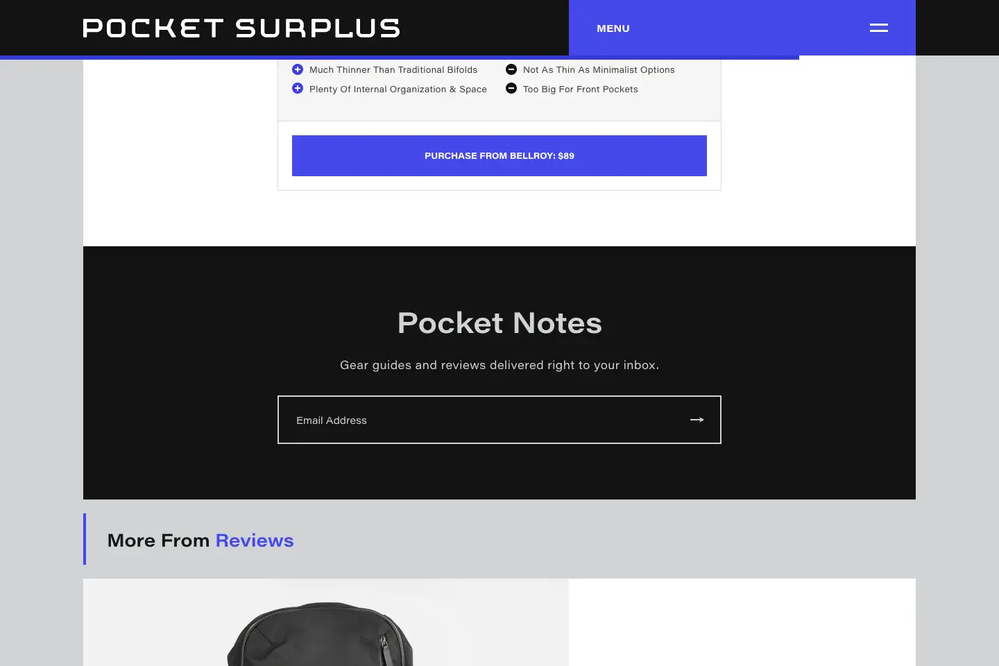
Once you have subscribers, it’s important to regularly send newsletters that provide value and reflect your blog’s content. Share your latest blog posts, exclusive tips, behind-the-scenes insights, and any promotions or offers you may have. Be consistent in your sending schedule, whether weekly, bi-weekly, or monthly, to maintain reader engagement.
By implementing a newsletter signup form, you can establish a stronger connection with your readers, build a loyal audience, and drive traffic to your blog. It’s a powerful tool to grow your blog and create a community of engaged readers.
Create an About Page
Creating an About Page is an important part of building a successful blog. This page lets you introduce yourself to your readers and tell them what your blog is about. It’s your chance to share your story, passions, and expertise.
When creating an About Page, it’s important to keep it authentic and genuine. Let your personality shine through and give your readers a glimpse into who you are. Share your journey, why you started your blog, and what you hope to achieve. In addition to sharing your story, include relevant information for your readers. Highlight your areas of expertise, the topics you will cover on your blog, and how you can provide value to your audience.
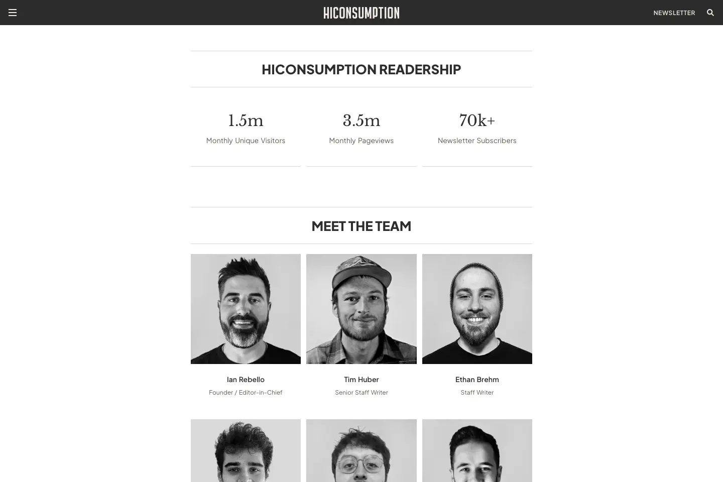
Remember to include a professional headshot and contact information about you as a founder. Include information on your authors and editors if you’re big enough, and make it easier for advertisers to reach out for sponsored posts.
Overall, the About Page is an opportunity to connect with your readers and potential partners on a personal level and build trust and credibility. Put time and effort into crafting a compelling About Page that reflects your brand and leaves a lasting impression on your readers.
10 best blog design examples
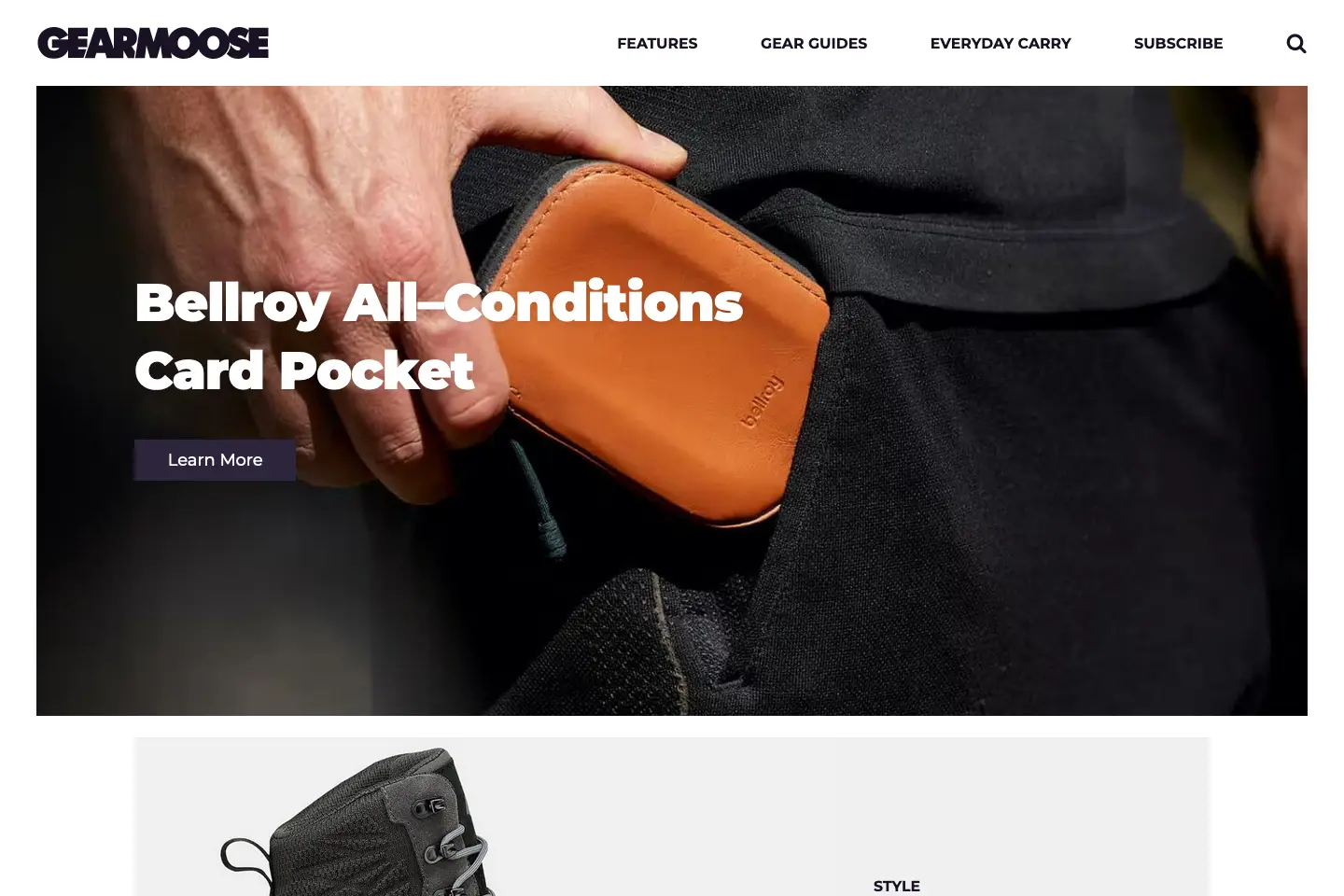
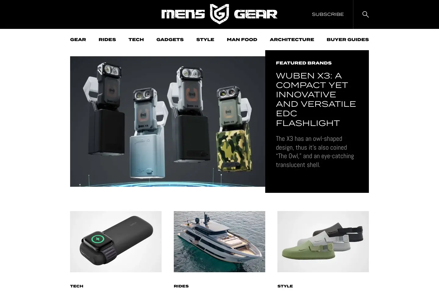
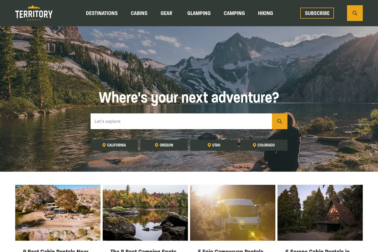
Now that we’ve covered the importance of a killer blog and how to choose the right platform let’s dive into some examples of beautiful blog designs. These blogs have mastered combining stunning visuals, user-friendly navigation, and engaging content to create a genuinely exceptional reader experience.
These are just a few examples of the many beautiful blog designs Fhoke has created for our clients over the years. Each one offers a unique and inspiring approach to design, proving that a well-designed blog can truly make a lasting impression. Whether you’re looking for clean and minimalist, bold and modern, or whimsical and artistic, there’s a blog design out there that will capture your attention and inspire your creative journey.
1. HICONSUMPTION

2. GearMoose
3. Men’s Gear
4. Territory Supply
5. Niche Pursuits
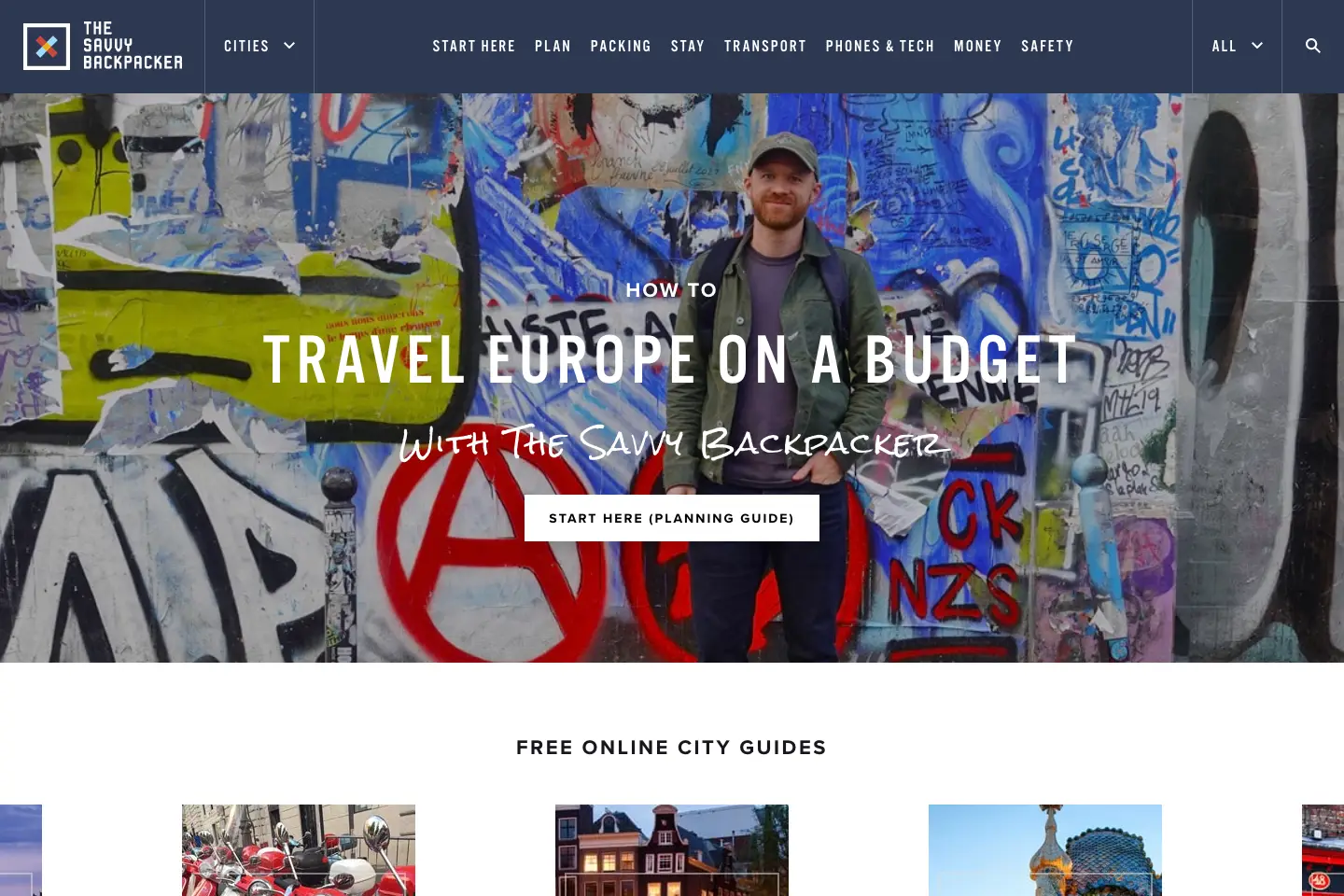
6. The Savvy Backpacker
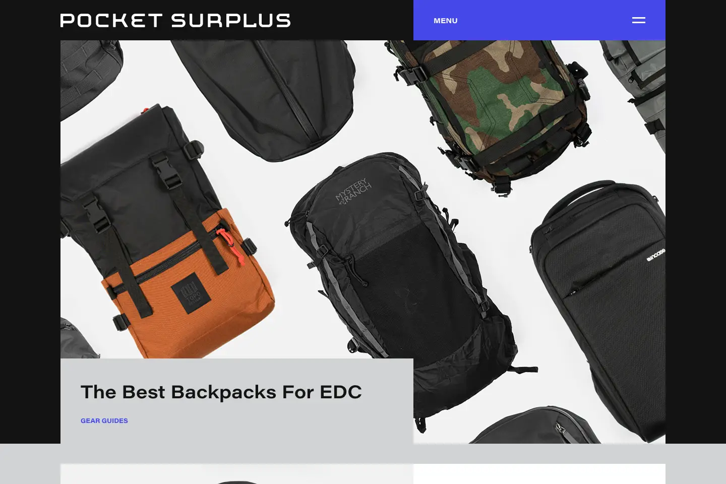
7. Pocket Surplus
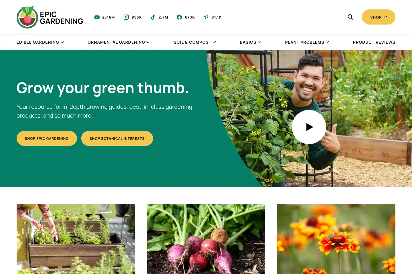
8. Epic Gardening
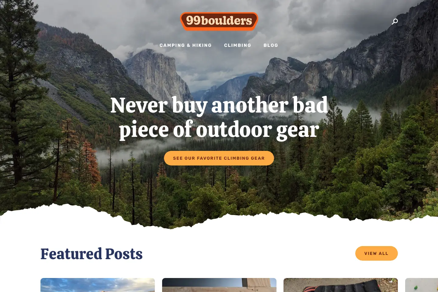
9. 99 Boulders
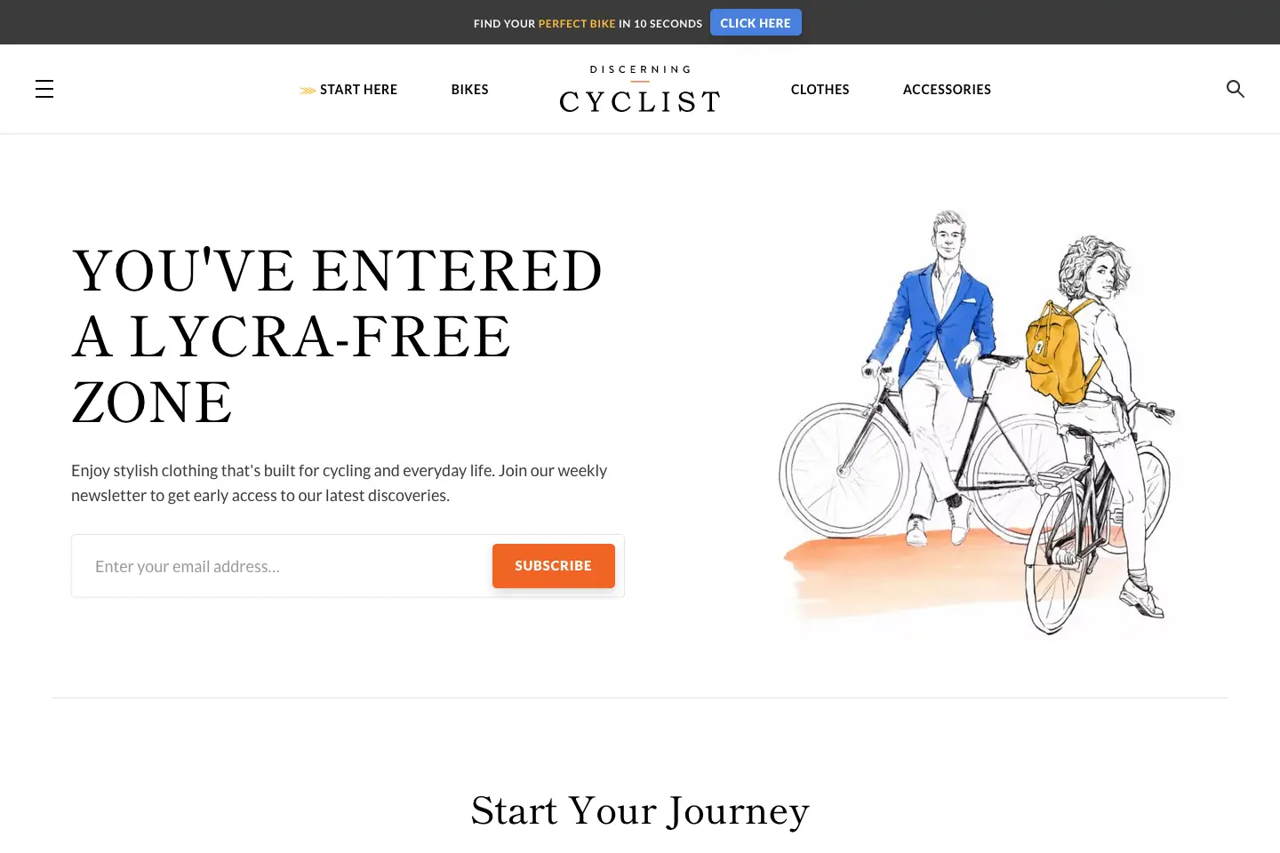
10. Discerning Cyclists
Final thoughts
The design of your blog plays a crucial role in its success. A visually appealing and well-designed blog can enhance the user experience, capture readers’ attention, and keep them engaged. Choosing the right platform, creating a stunning homepage, and incorporating lifestyle imagery are just a few strategies to create a beautiful blog design. A killer blog must also deliver exceptional content, pay attention to SEO, and engage with its readers. It’s also important to prioritise responsiveness, show related posts, implement a newsletter signup, format your blog posts effectively, and have a clear and effective navigation system. By considering all these aspects and exploring some of the best examples of beautiful blog design, you can create a visually stunning and successful blog that leaves a lasting impression on your readers.
We are experienced in making blogs a success. Contact Fhoke to start your journey, or Book A Call with Ben, our resident expert.
