Established in 1989, SB Joinery is a family firm that produces high-quality bespoke joinery for the UK’s finest homes and commercial buildings.
With a commitment to quality and style, they have grown over 26 years to combine traditional craftsmanship with the latest manufacturing technology. Their attention to detail has contributed to their reputation of quality and craftsmanship.
Operating out of factories in the heart of the Hampshire and Somerset countryside, they pride themselves by employing some of the finest craftsmen, who are highly experienced and passionate about their work. That quality of craftsmanship is demonstrated in satisfied customers referring others to them, which has led to the business’s huge growth from one man’s passion for joinery to over 70 staff.
Out With The Old, In With The New
Back in April this year, we approached SB Joinery about refreshing their brand. It was a story of the right place, right time.
Having undergone a rapid expansion, SB Joinery were looking to re-position their brand to reflect the inspirational business that it has become.
Working as a team, we looked at what was important to them as a family firm, how they wanted to be perceived and what their customers expected to see. As a premium product and service, the new look had to reflect all those goals, increase leads and present them as the joinery manufacturer of choice in the UK.
Where We Began
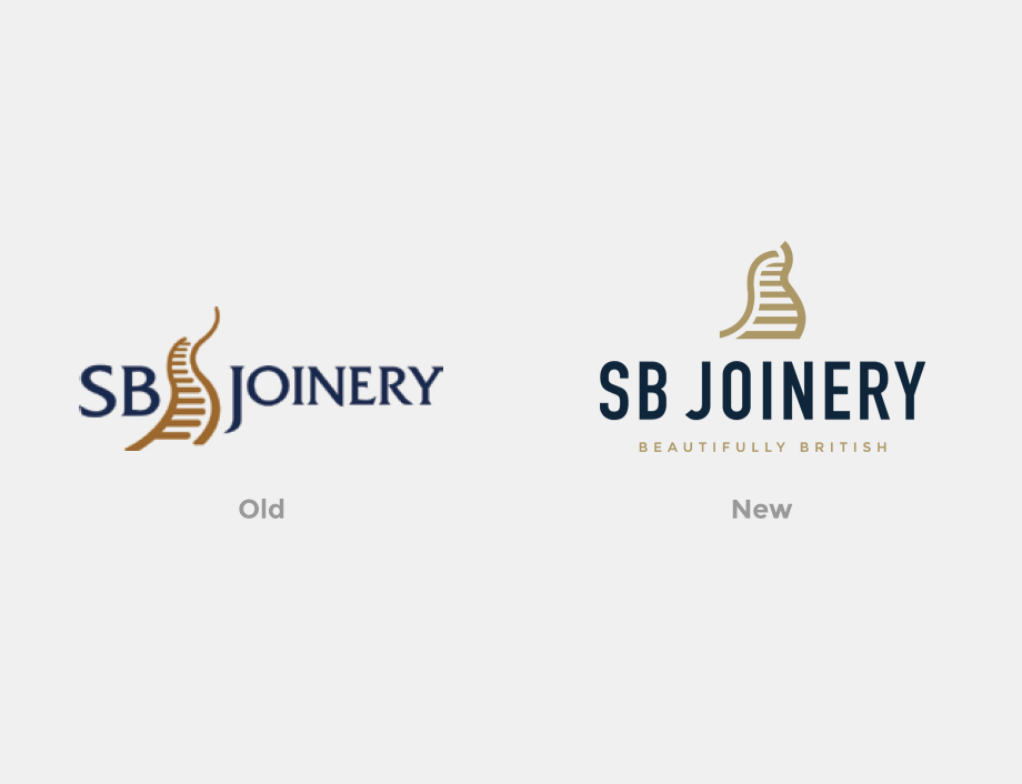
The project’s first phase was to ensure the brand could stand the test of time for another 10+ years. The existing logo had heritage and meaning for the firm, so it was a matter of evolving that and pushing it forward rather than starting again.
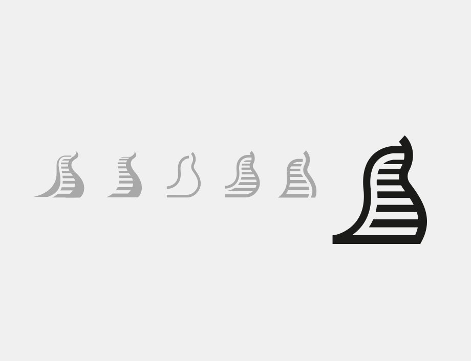
The logo mark was the first step in deciding the direction of the new logo. The existing mark was the two letters S and B combined to represent a staircase. Although the staircase was prominent, it wasn’t as clear for the letters. We took this through several iterations to how the new logo looks today.
With that solved, we looked at fonts. The existing logo used a serif font that was inconsistent and dated the modern vision of the firm. We looked at many fonts but chose a very clean San Serif that was bold would be timeless and complimented the new logo mark.
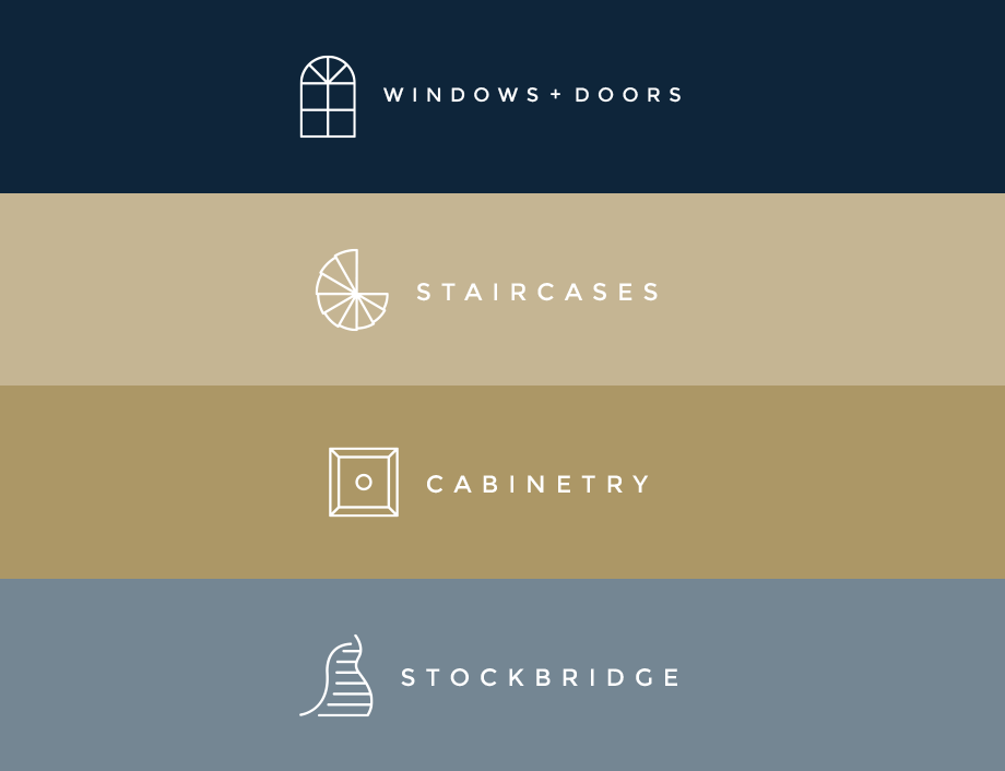
We also looked at the branding of the firm’s products. This was a key part to help separate themselves from competitors and help customers find the right product. It gave each one importance and will lead to standalone Lookbooks and marketing brochures in the future.
The new logo has been hugely successful. Although not a drastic change for the company, it has certainly given them a modern brand that stands out in the industry. Slowly rolling out through signage, vehicle wrapping, internal and external marketing material, it’s been no small job.
Guidelines
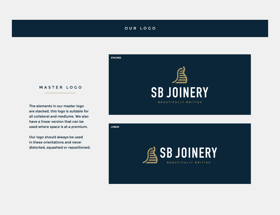
We didn’t stop there. To give the brand consistency across everything, we needed to create a simple brand guideline so that SB’s team knew how to use their new look. With an investment into a brand exercise like this, it’s common for us to create guides so that there are certain rules to follow as a company continues to expand.
Here are a few pages taken from the guide:
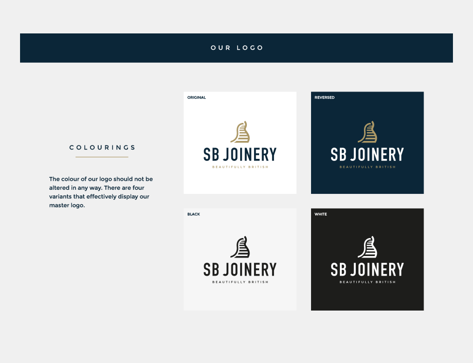
In particular, we looked at the main colours. These had always been a Dark Blue and a Copper Brown. The Blue was chosen for heritage reasons whilst the Copper to reflect the wood used day-to-day. Although they worked well, the website brief was to bring a touch of class to the brand, so with a small tweak to the Blue and the Copper swapped out for a Gold, the brand finally came together, complemented by a great strapline of ‘Beautifully British’.
Website
With a new brand in place, the website was the next phase.
Old, dated and hard to navigate, the old design wasn’t working, and with an increase in mobile traffic, it was a must to make the site compatible with all devices.
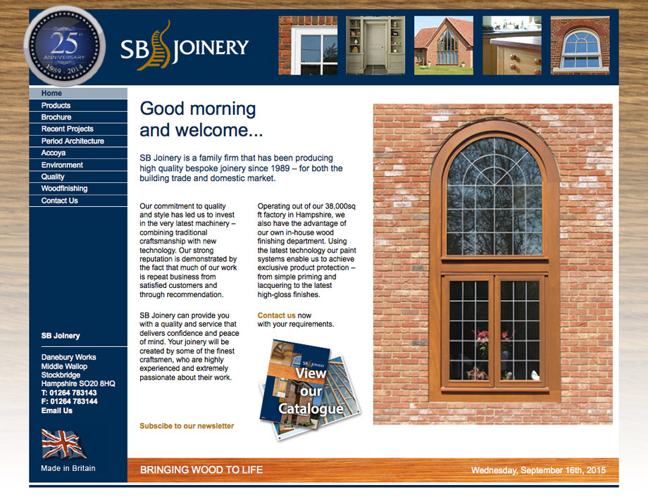
The new website needed to show off the stunning work SB Joinery are known for whilst working hard to convert visitors into leads, tailoring each page to help maximise these conversions.
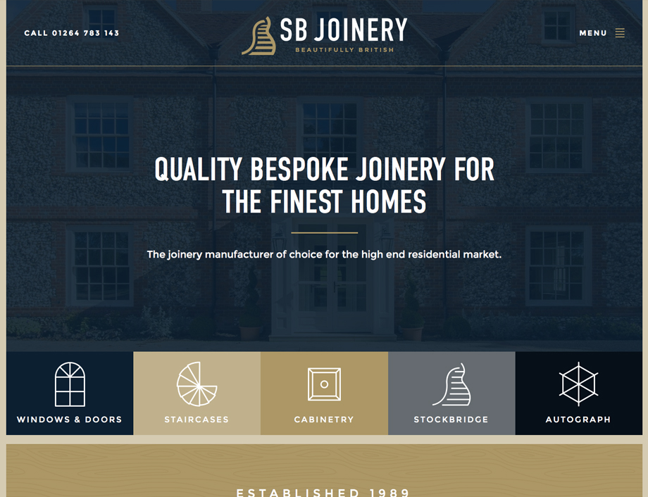
We launched a super slick website that replaced a very outdated and under-performing website. The new site now gives SB Joinery a true showcase of their amazing work and will help them engage with their target market more easily whilst reflecting a beautifully British brand.
What Next
We’ve started to work with a marketing partner to manage all their online Ad campaigns through Google and to help build their social media platforms, something they have neglected until now.
We are also looking at designs for several Lookbooks bound and boxed in stunning fashion, with further offline marketing brochures in the pipeline. We really are their brand angels.
Need Something Similar?
Is it something you need for your business or company? Then talk to us. We love to be brand angels and help anyone from sole traders to large corporates.
