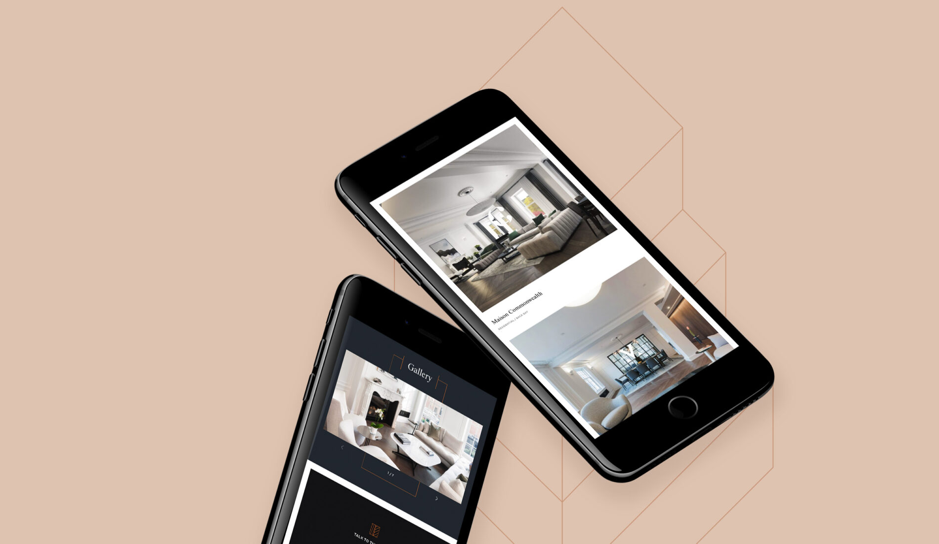
Branding
Combining a subtle palette of accent and primary colours, the Chevron brand allows the work and photography to do the hearvy work of engaging with their users. In contrast, the chevron shapes in the logo allow interesting patterns to frame these.
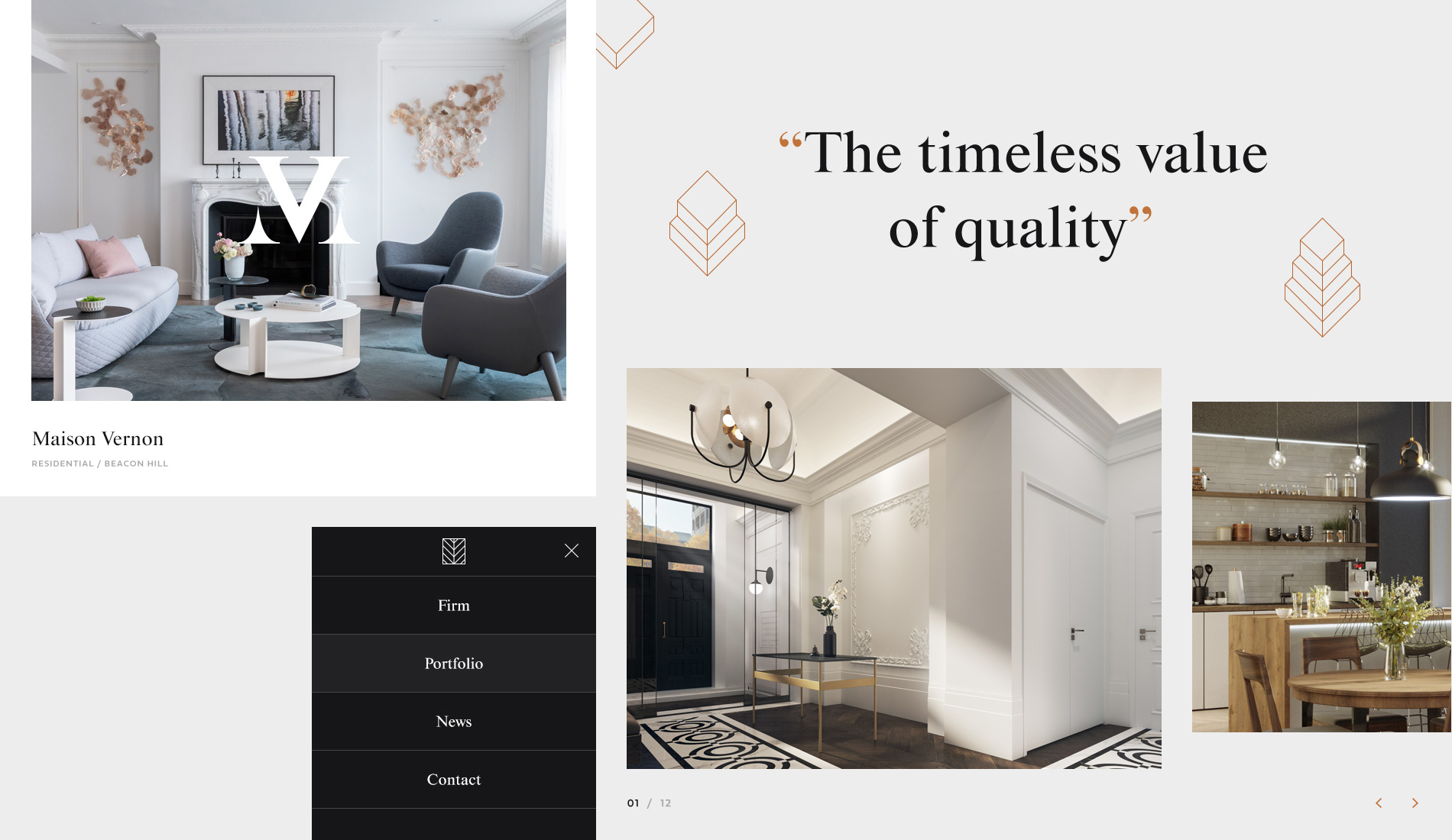
Design
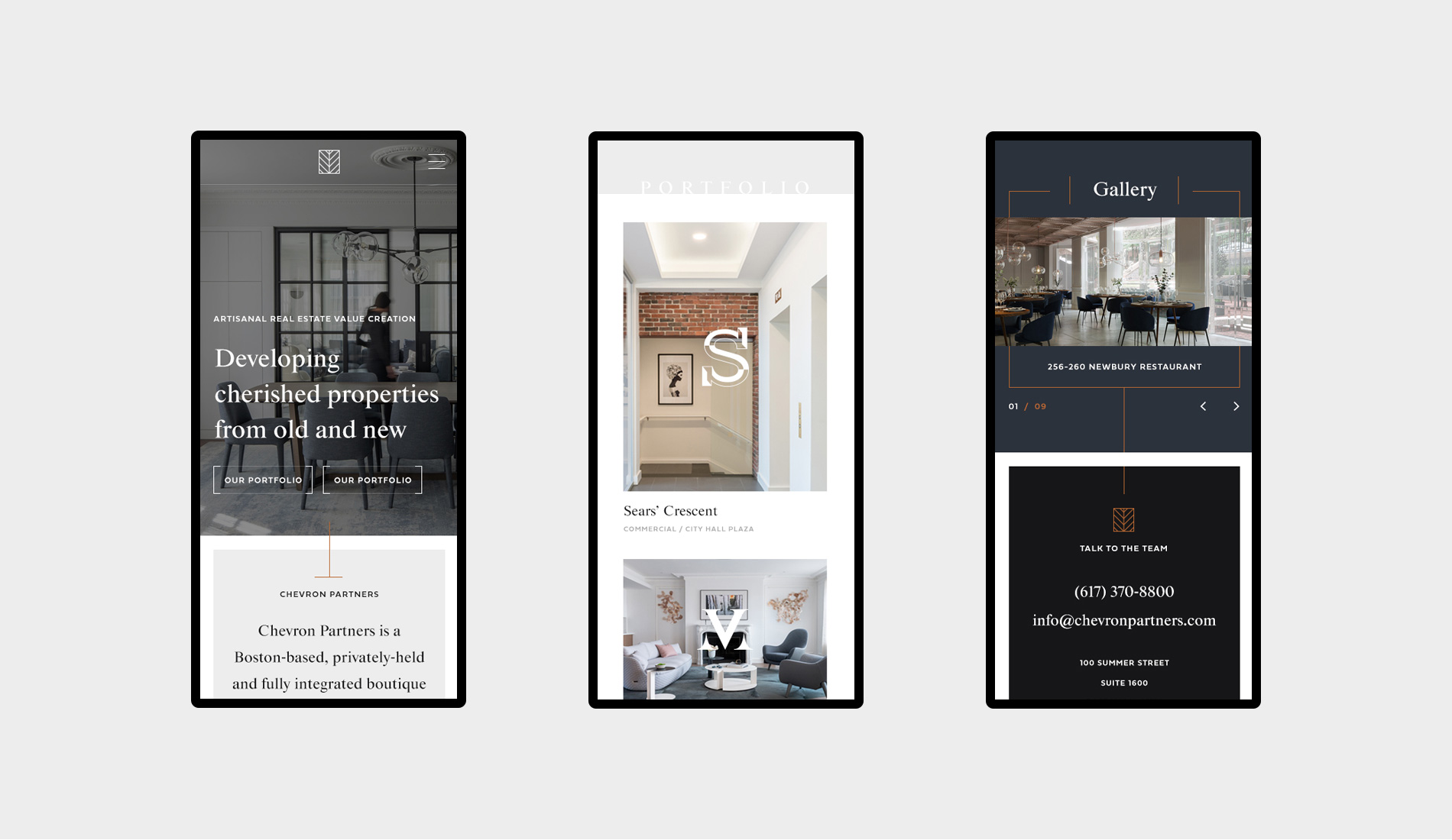
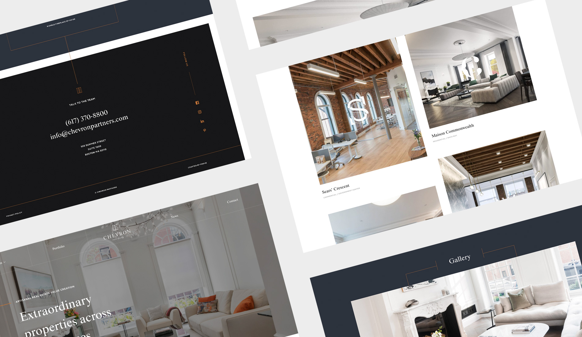
We created a striking new design, working with the existing brand. Light areas contrasted with dark and large format images capture the essence of the brand, and the design touches in their developments.
Development
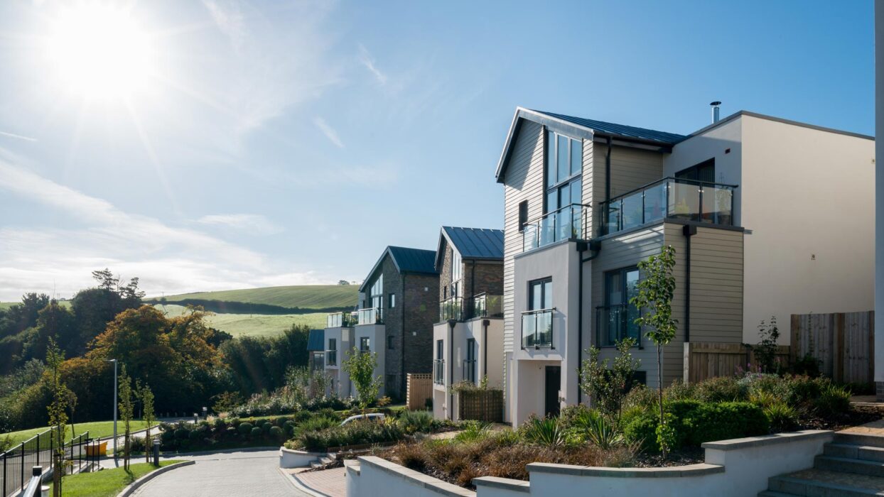
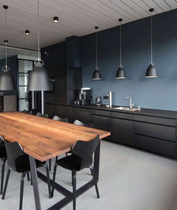
Big images, bold layouts and subtle page animations bring the Chevron Partners website to life. The firm now has a site that will help promote their unique and extravagant developments in and around the Boston, USA area.
“Can't recommend Fhoke enough! An amazing eye for design and user experience, clear communication and they are so fast with getting things done – a pleasure to work with! We are so happy with our site and look forward to working with them again.”
The result
Designed to promote luxury developments, the new Chevron Partners website couples aesthetics, with clear navigation and call to actions for maximum conversions.
