Branding
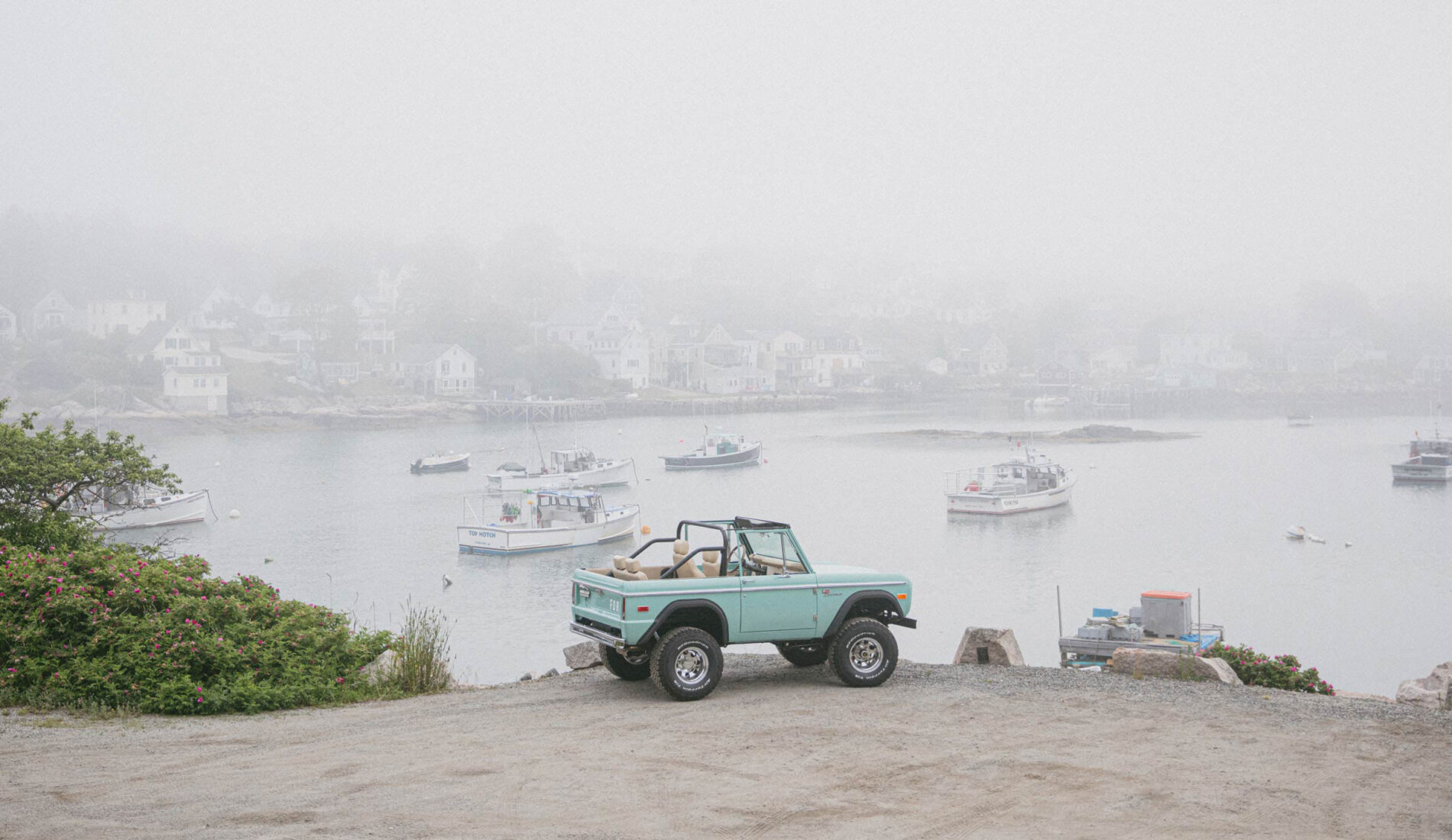
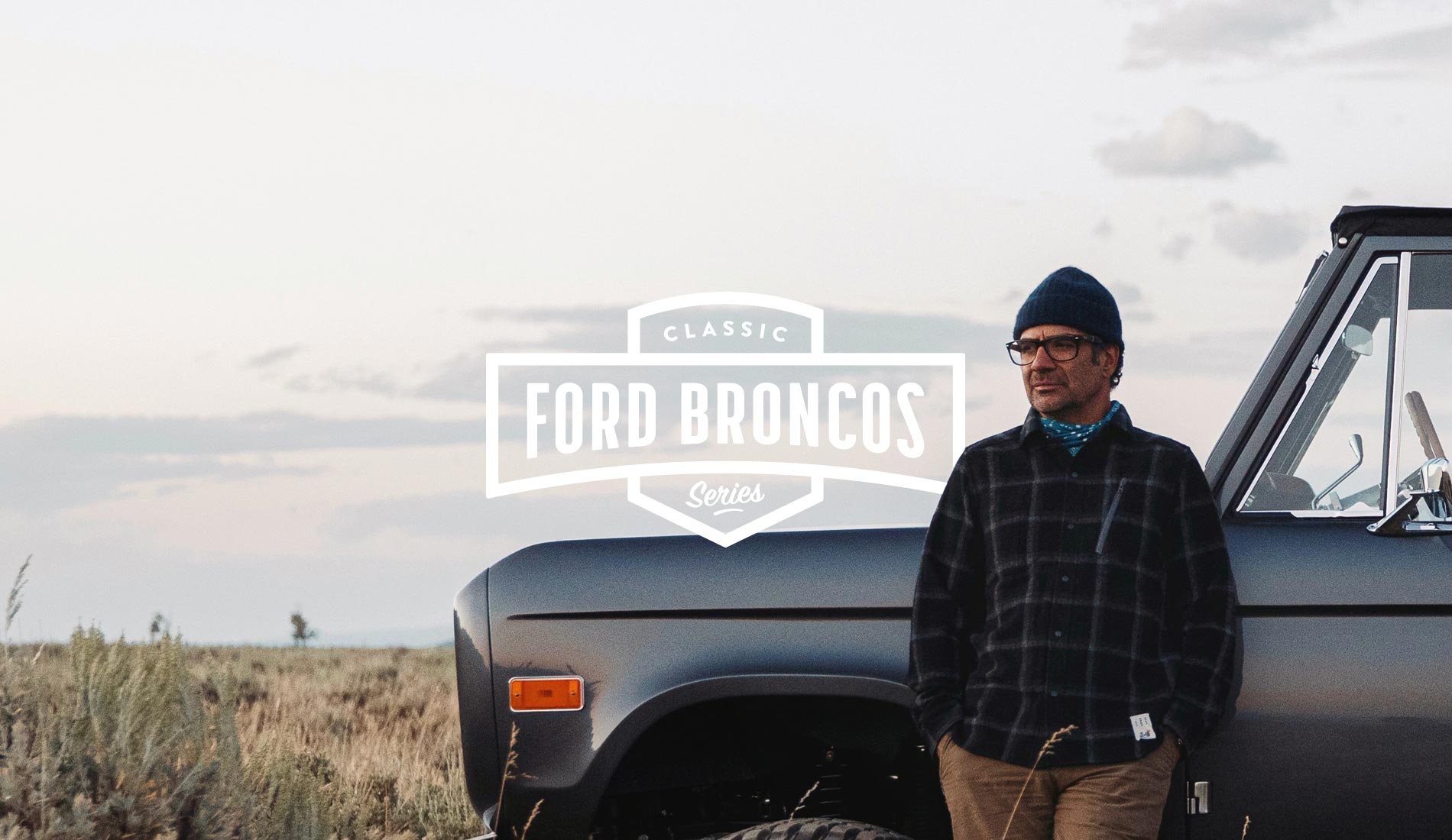
A project with CFB starts with an original Classic Ford Bronco produced from 1966 to 1977. Add new metal, a new engine and transmission, off-road tires, a hint of luxury, and of course, a modern brake system. It looks mean. It sounds great. It performs like a boss. Pure fun on the pavement or off.
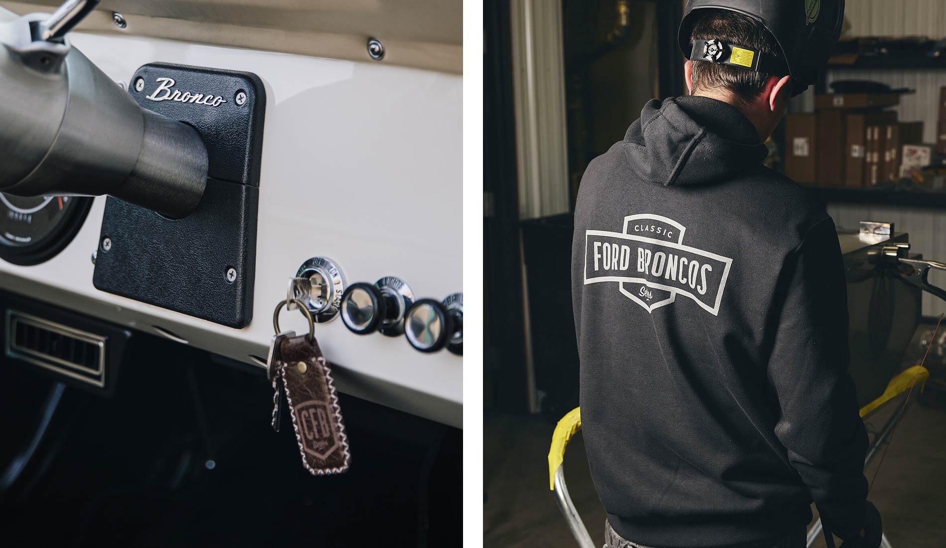
We upgraded the Classic Ford Bronco brand in 2016, creating a visual identity that captured the company’s values, vision and mission. The result was as timeless, bold and impactful as their trucks and still stands strong today. The initial brand roll-out included a real head-turner of a website that played an instrumental part in raising CFB’s online profile.
Website Design
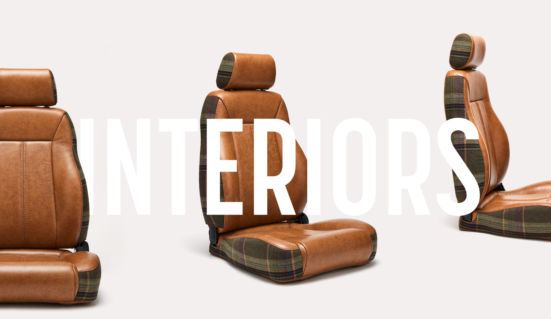
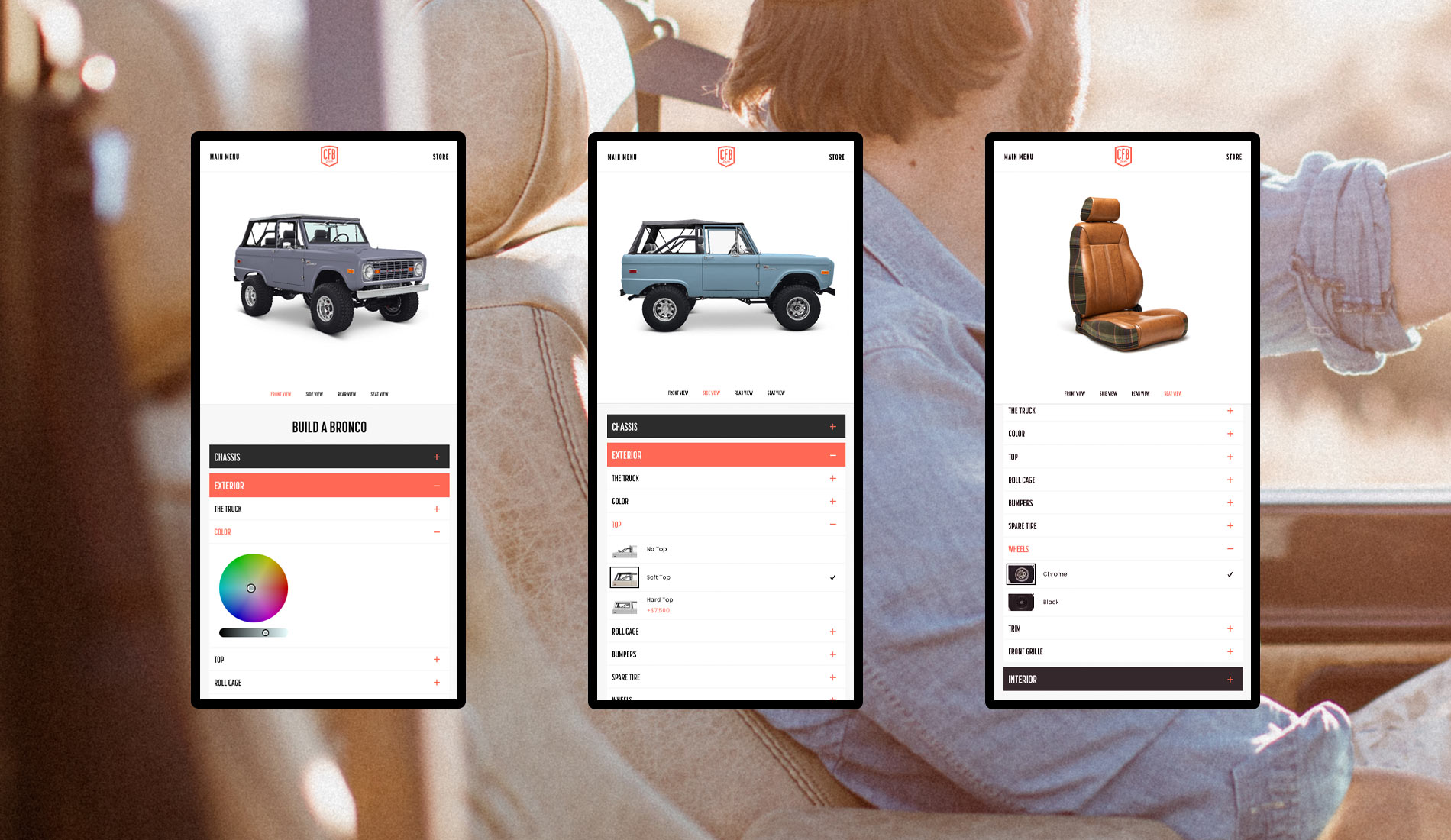
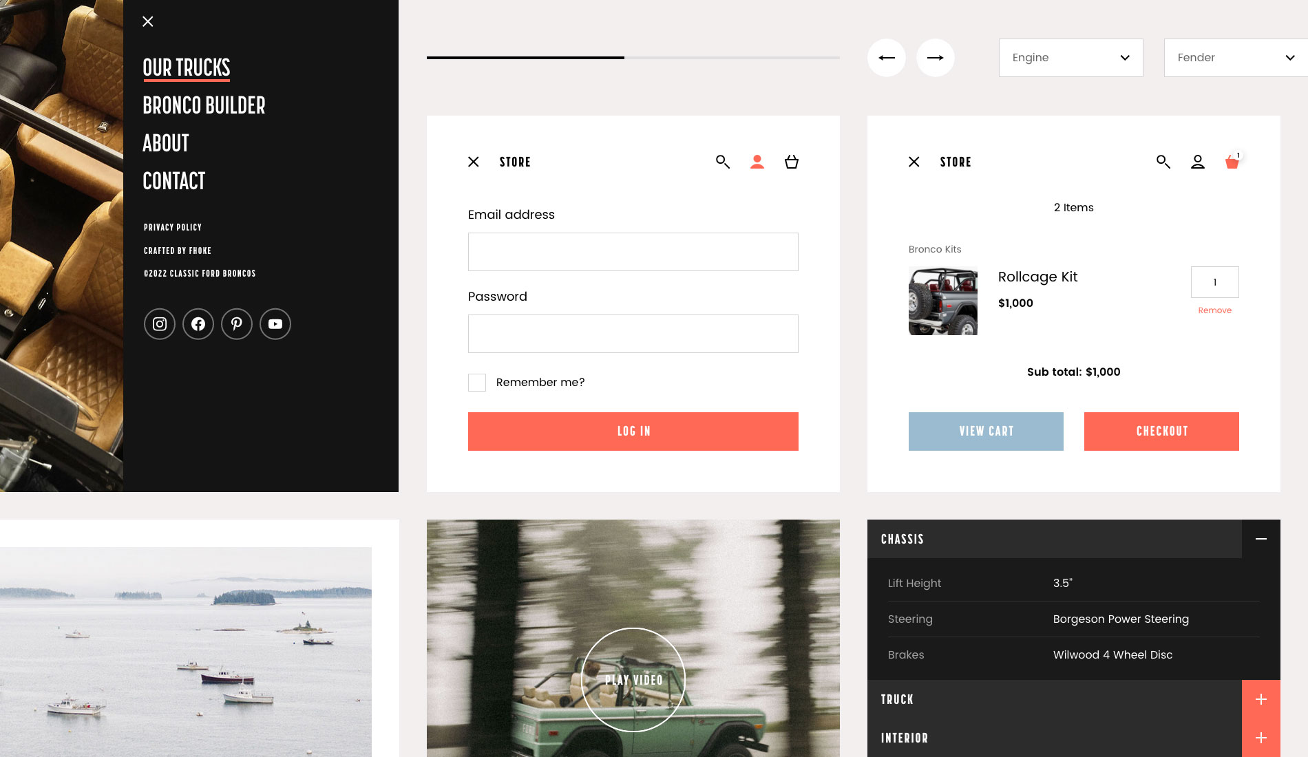
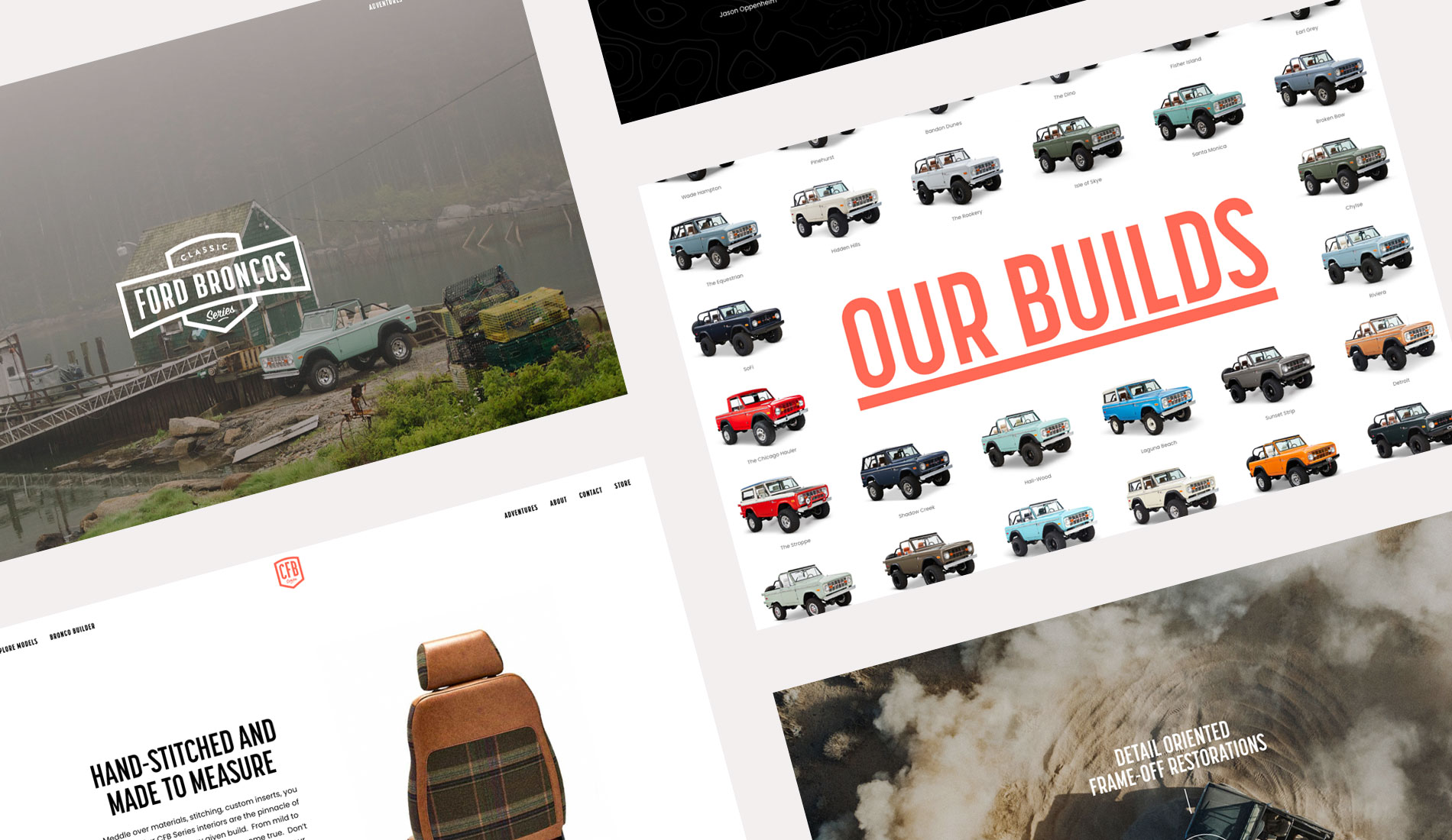
Over the past six years, the site has grown with the addition of a fantastic Bronco Builder tool which captures the user’s imagination whilst allowing CFB to capture user data. The overall look and feel had remained pretty much unchanged since 2016, but the company and its offering have grown with bigger upgrades, more inventory and info on all things Bronco. We got to work on planning, designing and delivering an awesome new WordPress site with a fresh punch of colour, cleaner lines and an image-led approach to suit the sophisticated tastes of today’s audience.
WordPress Development
Built on WordPress, the Classic Ford Broncos website is as flexible as it is beautiful. The frontend is representative of Fhoke’s signature styling; super slick and stylish with subtle interactions that enhance the user experience leaving a positive and long-lasting impression.
"The team rock! I have no hesitation in recommending these guys."
Result
The new look Classic Ford Bronco’s strikes the right balance of cool, creativity and classic styling. It’s a site that reflects the company perfectly and will stand them in good stead for many more years to come.
