Branding
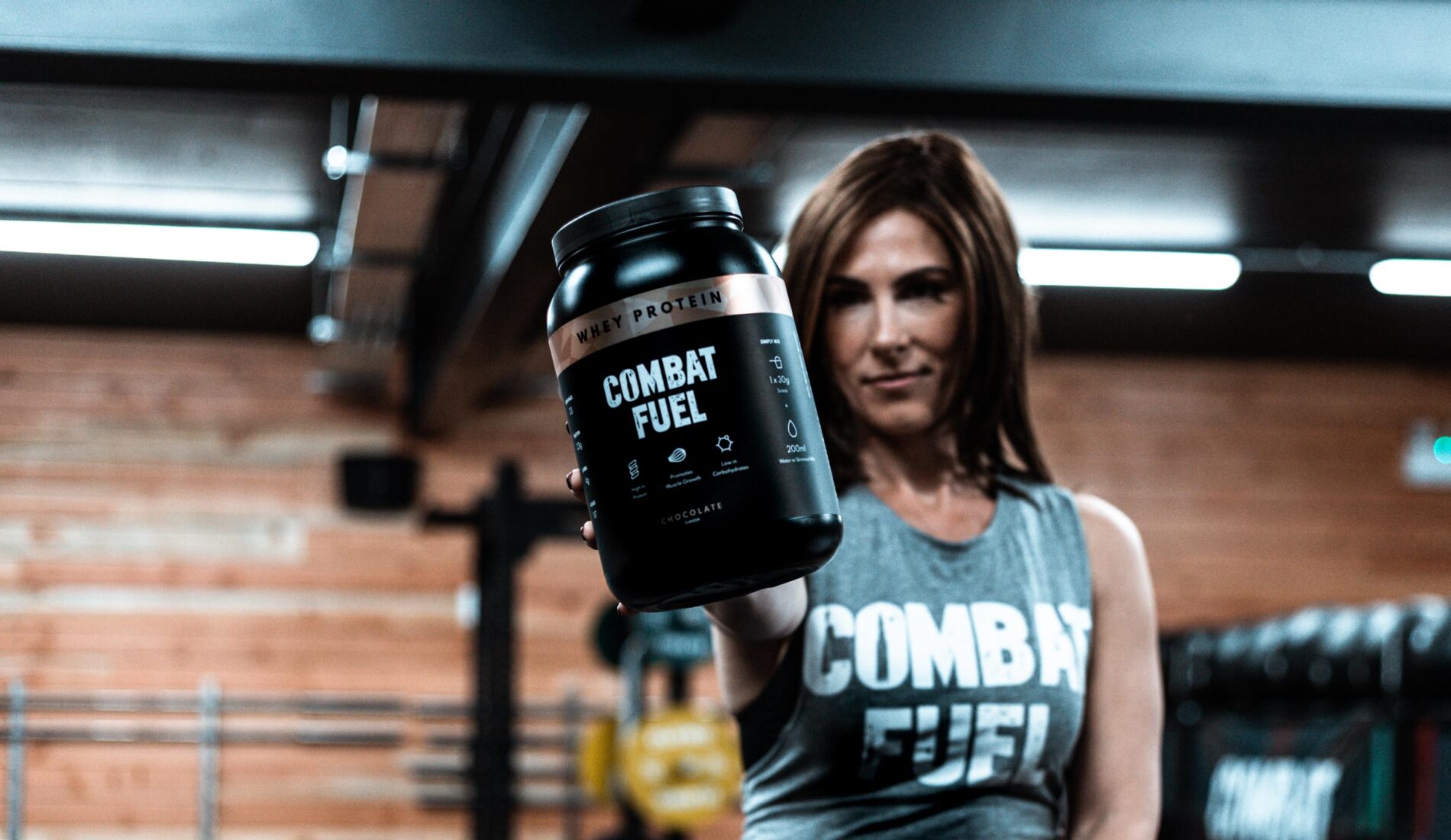
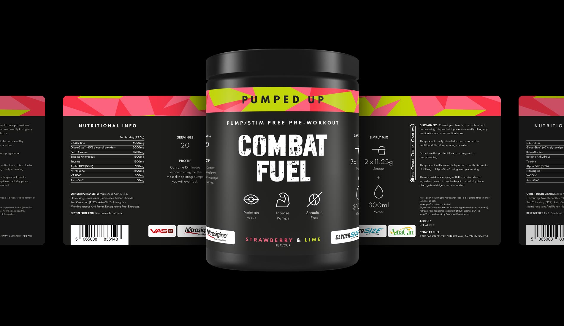
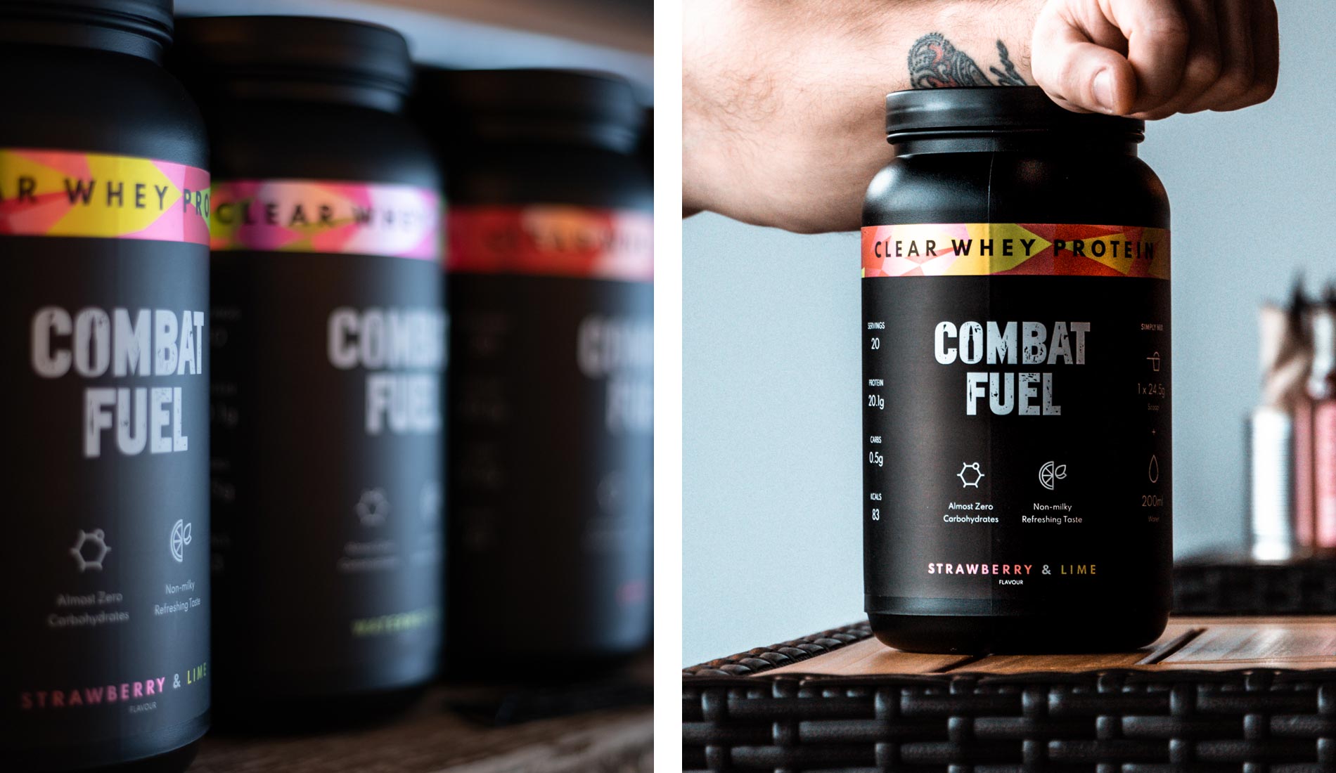
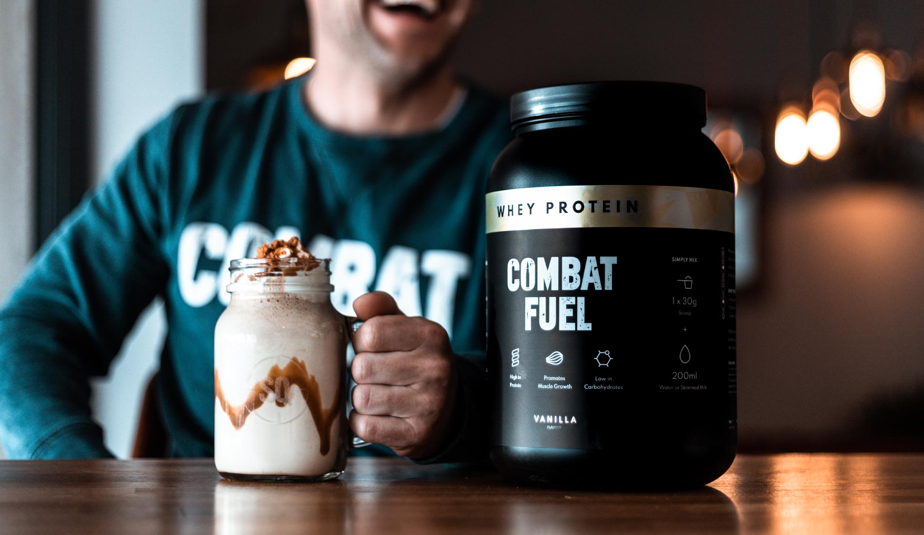
To appeal to a broader market, the brand needed an overhaul. The company already had a regular military following due to its background and heavy warfare themed branding. To gain a wider interest, we got to work on cleaning up their packaging, opting for bright colours, clean graphics and structured layouts. Now on the shelves, Combat Fuel’s products have reached the market with rave reviews and endless compliments about their refreshing, new style.
Website Design
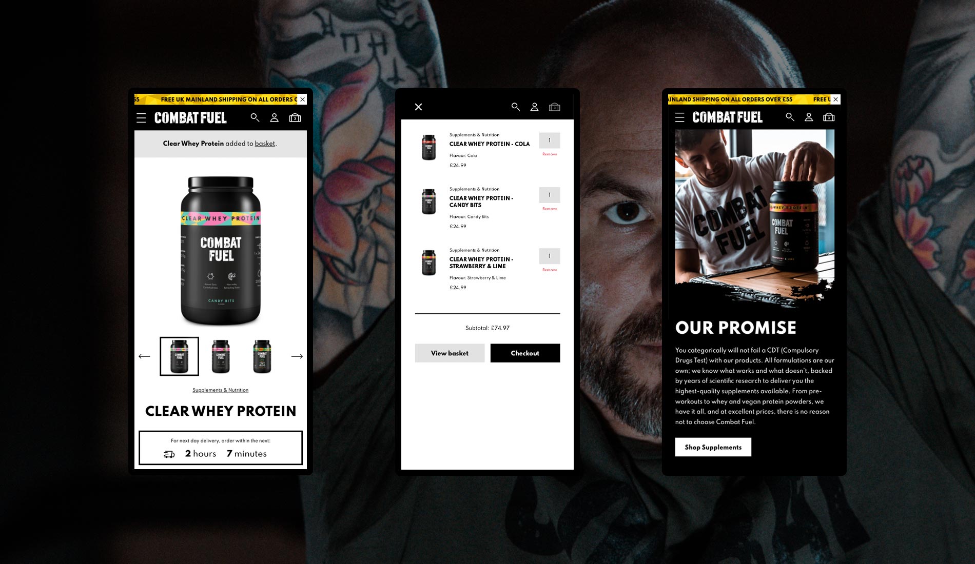
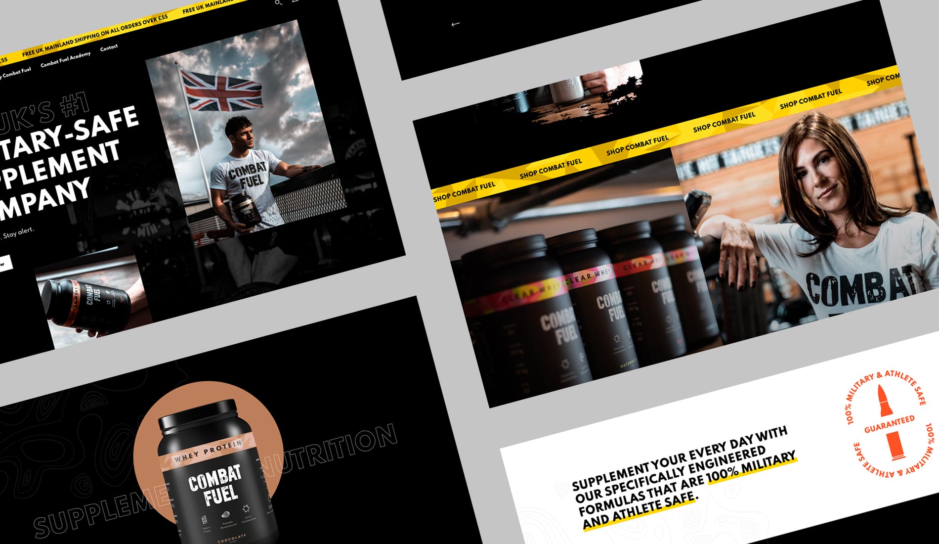
To house a wide range of products with fresh new packaging, we needed an awesome new site design. A website that speaks to its audience – daring, bold, and built for the long haul. We wanted to create something super special that felt like an extension team’s personality, reflecting their vision and mission of being the best in the business. It’s bright and colourful with unique visual cues which add authenticity, engagement and impact throughout.
WooCommerce Development
The goal was to create a site with a focus on product and ease of use. We built in the ability to cross-sell products, create bundles, and buy products with as little as one click. As experts in WordPress and a trusted WooCommerce Agency, they became the tools of choice – capable, flexible, and infinitely customisable.
“A massive thank you for all of your hard work throughout, I'm genuinely gobsmacked by it all. Wholesalers are knocking at my door already as a result of the new branding, and the feedback from customers is second to none.”
The result
Our best work is created when we’re in full collaboration with our customers, and this project was a result of that. Two parties with one clear goal – to make Combat Fuel stand out in a fiercely competitive sector. We’re on a journey of domination, and we’re not done yet.
