Brief
Not only are GearMoose passionate about beer, but they are also mildly obsessed with everyday carry gear, knives, awesome videos, whiskey, custom motorcycles, minimalist wallets, and other stuff you probably don’t need.
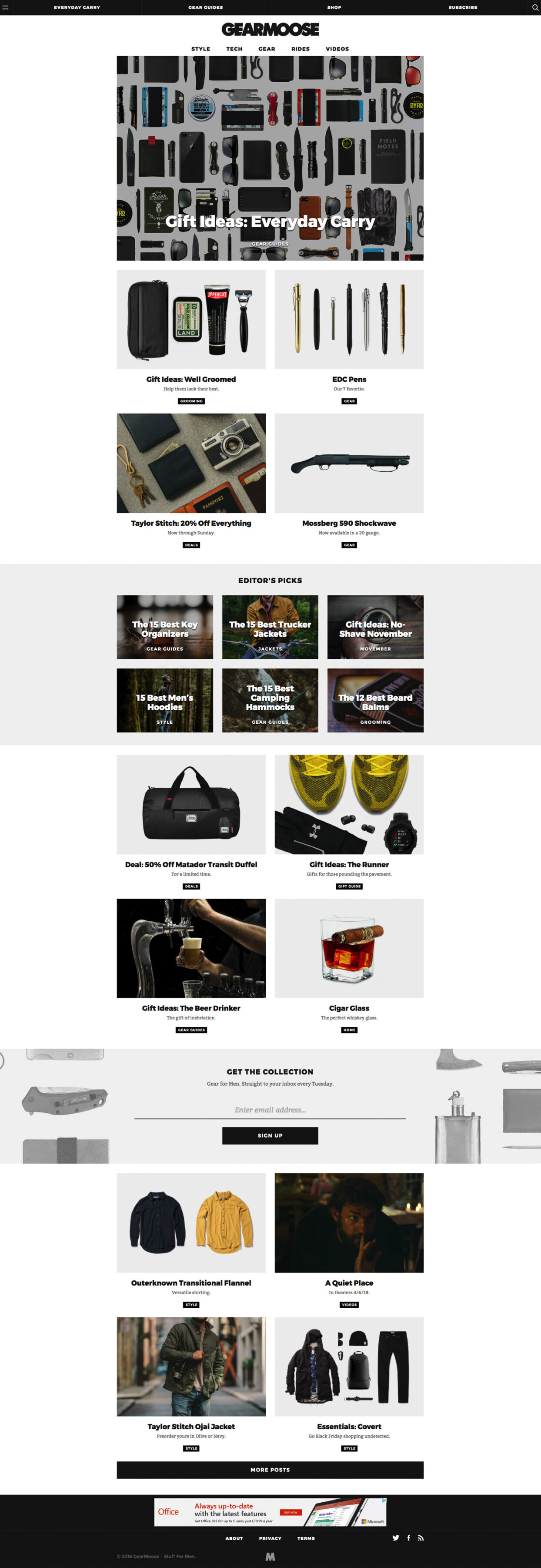
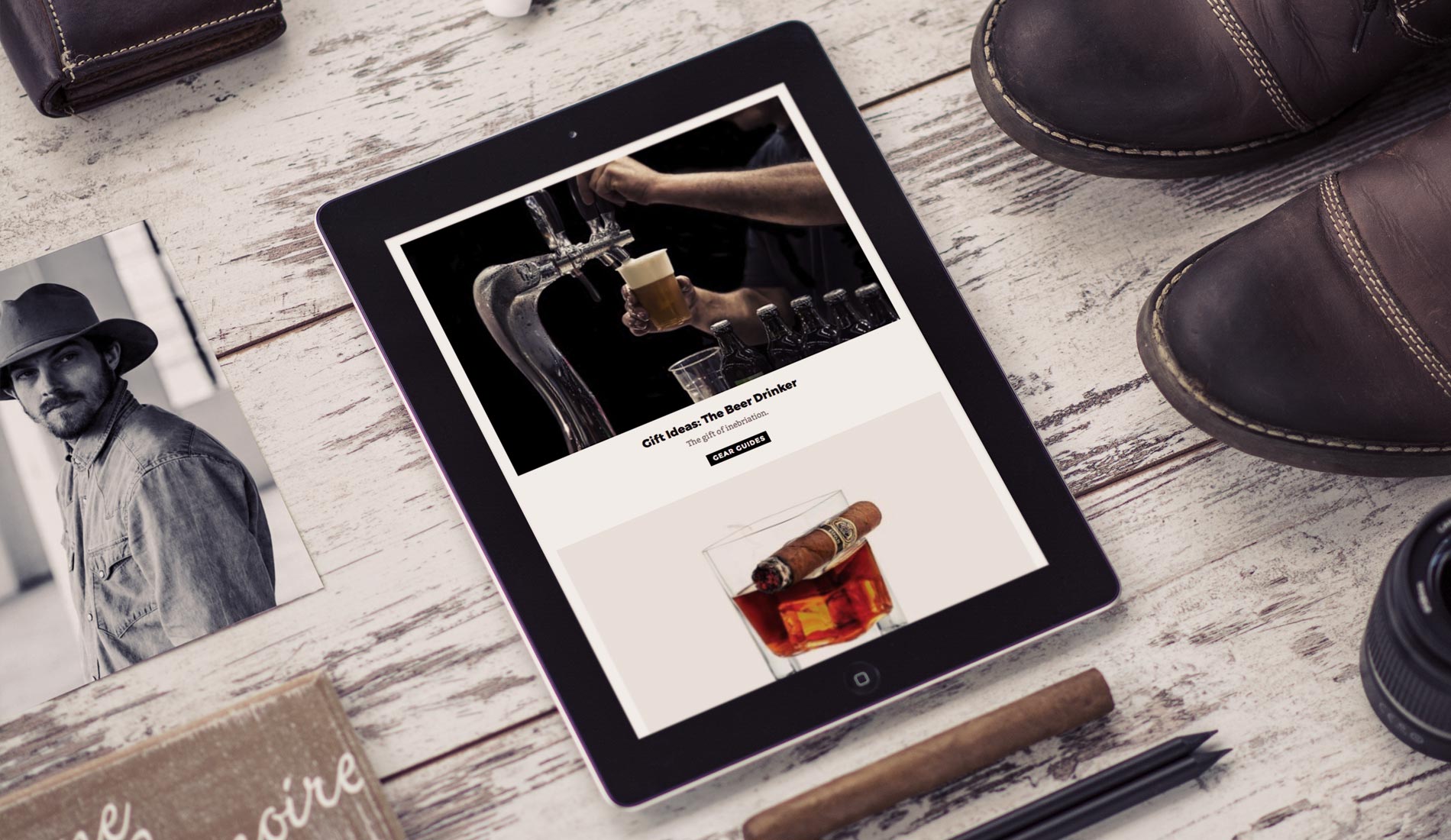
We were tasked to design and build a new site for GearMoose around the stunning photos and articles the staff publish every day. Working hard to make each article clearer to read than before we were also asked to help increase the time each visitor spent on the site by introducing links to deeper pages.
Solution
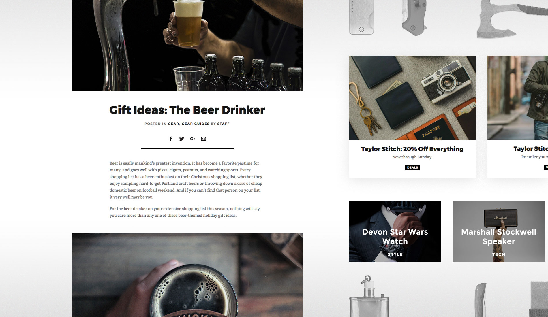
Scrapping an off-the-shelf WordPress theme, we designed a bespoke set of templates for every page of the website. Using simpler colours, heavier title text, and a cleaner typeface for the body we gave GearMoose a strikingly simple identity. We also introduced a bold new logo to reflect the more masculine look and feel of the new site.
“From the very first email, the guys at Fhoke were professional, responsive, and very attentive to the needs of my growing business. I'm definitely a hard customer, but no request was too small. They swiftly and professionally executed the entire process - from design to development, while maintaining a friendly demeanour. They're the kind of people you'd want building your website and to have a beer with afterwards.”
Result
A fantastic looking digital magazine that replaced a standard WordPress theme. The new website is beautiful, super slick, and features some sweet hover states to give the site a final touch of polish.
