Brief
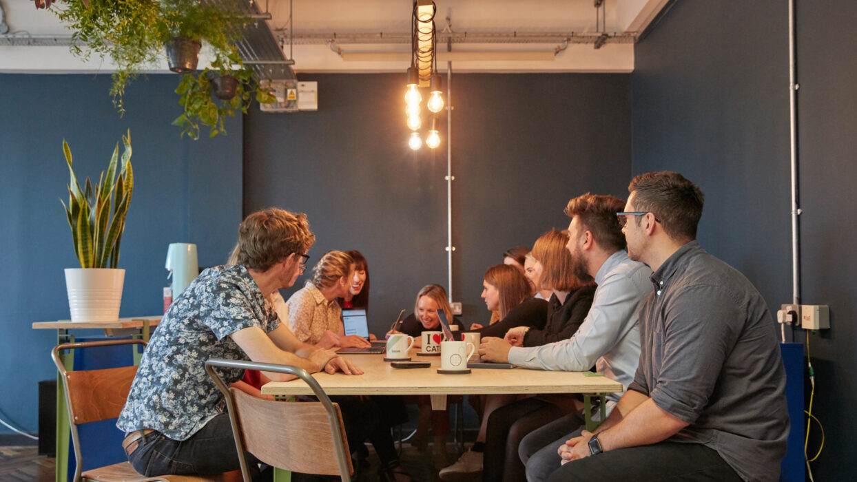
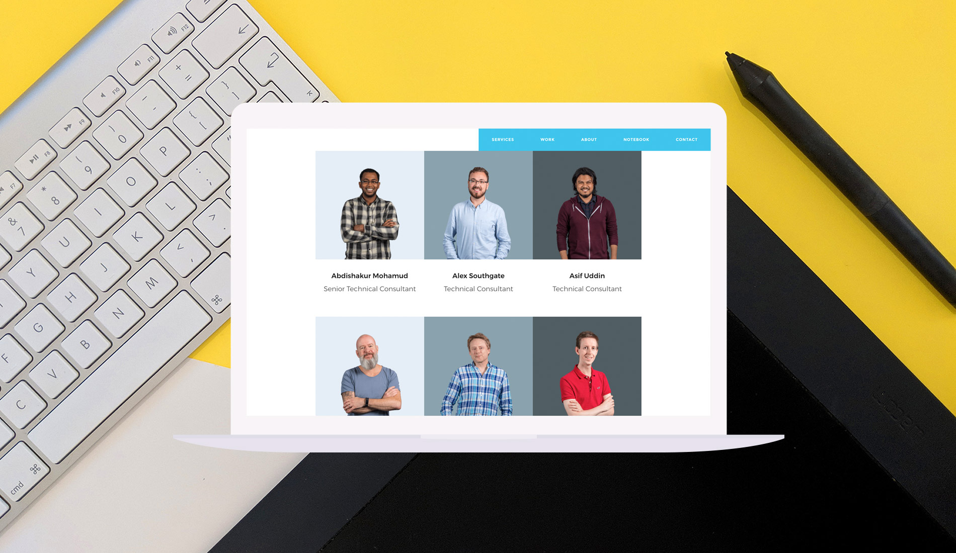
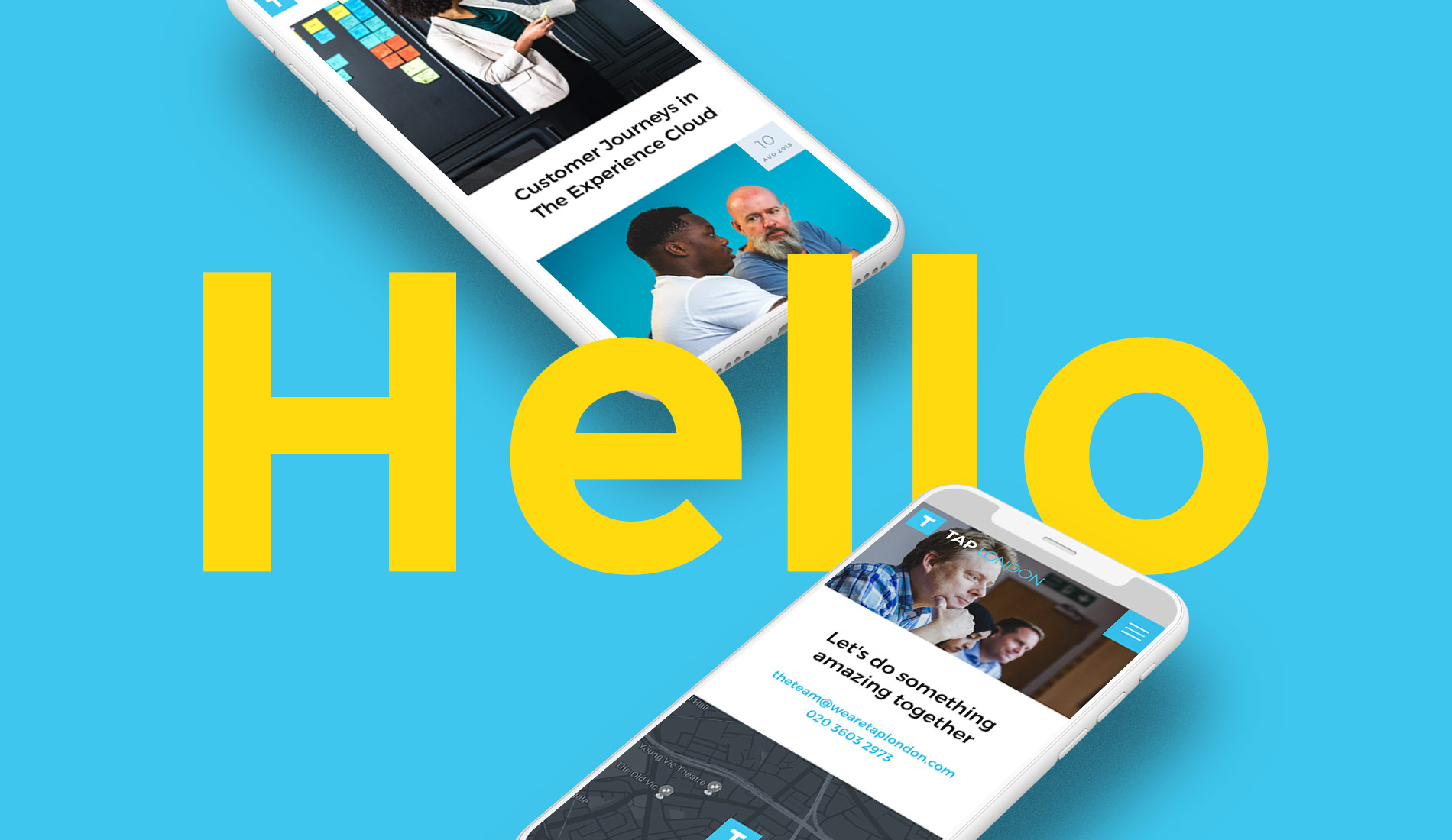
TAP London is just one of a handful of agencies in the UK that specialise in the Adobe Experience Cloud. In the heart of London, just a stone’s throw from Waterloo, the growing team had grown tired of their one-page website and needed one that reflected the brand’s expansion. Up against several other agencies, they chose us to create a multi-page WordPress site that promotes their services, focuses on their work, and highlights the team.
Website Design
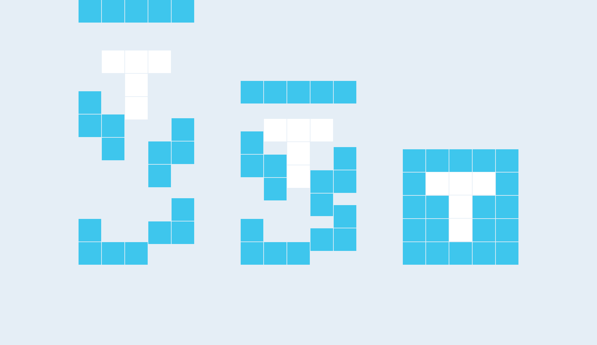
Starting with a pretty much blank slate, we were able to guide TAP London on its content strategy, images, and look. While the logo was left untouched, we evolved this by creating unique animations across the site around the bold ‘T.’ While we were at it, we added finishing touches with subtle page transitions, hover states, and scroll effects. The result was a bespoke WordPress theme, which was as unique to them as the service they offer clients.
“We couldn’t be happier with our new website. Fhoke listened to the brief and came up with something far better than we had imagined - we finally have a web presence that we can be proud of. Our website was delivered on time and on budget, and more importantly, it looks amazing. We wouldn’t hesitate to recommend them.”
Result
The end result is a site that not only reflects the direction of TAP London, but our vision for the brand. They entrusted their image with us, giving us the freedom to run with our ideas. The result? The envy of their closest competitors and a site that both companies are extremely proud of.
