Brief
Despite being more than five years old, Taylor Made had no website or online presence. The brand was dated and didn’t reflect the vision of the company. Taylor Made required both of these to be revisited along with a direction on how to channel their users quickly to the right information.

Solution
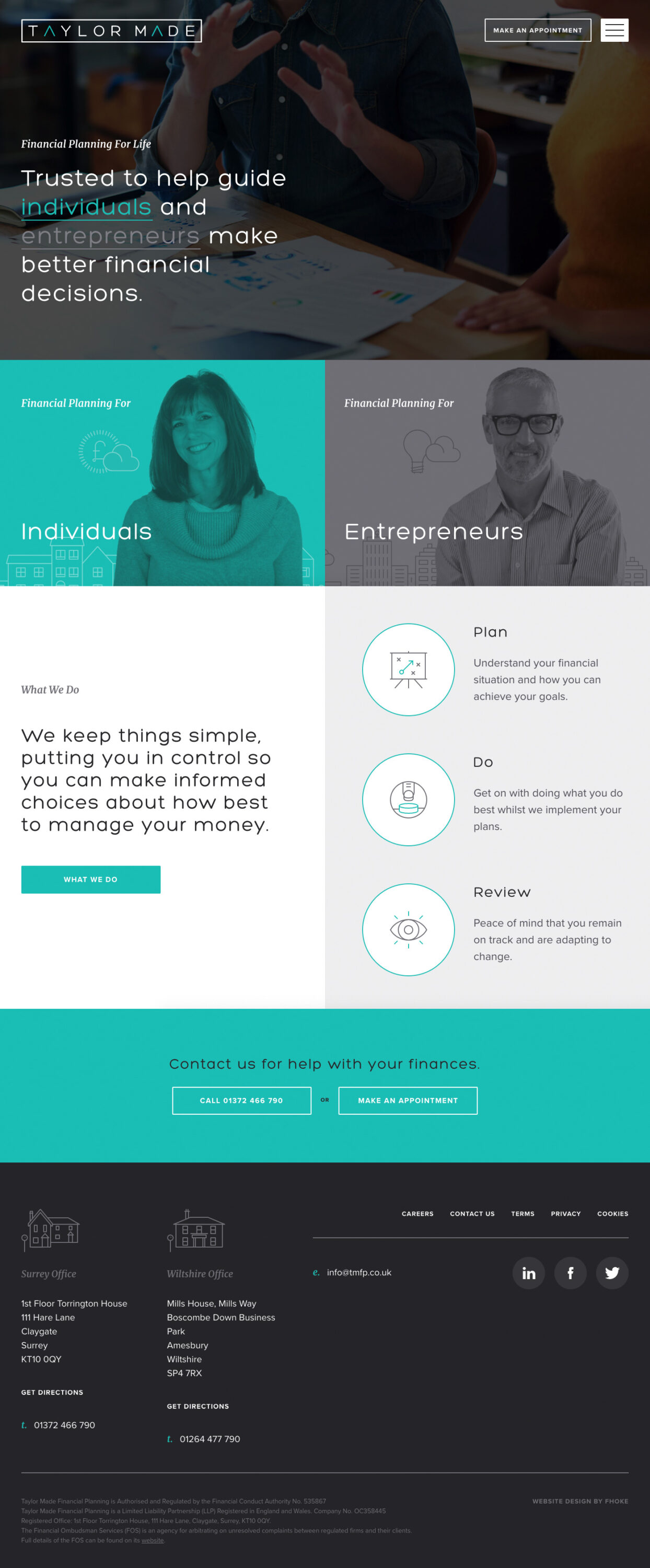
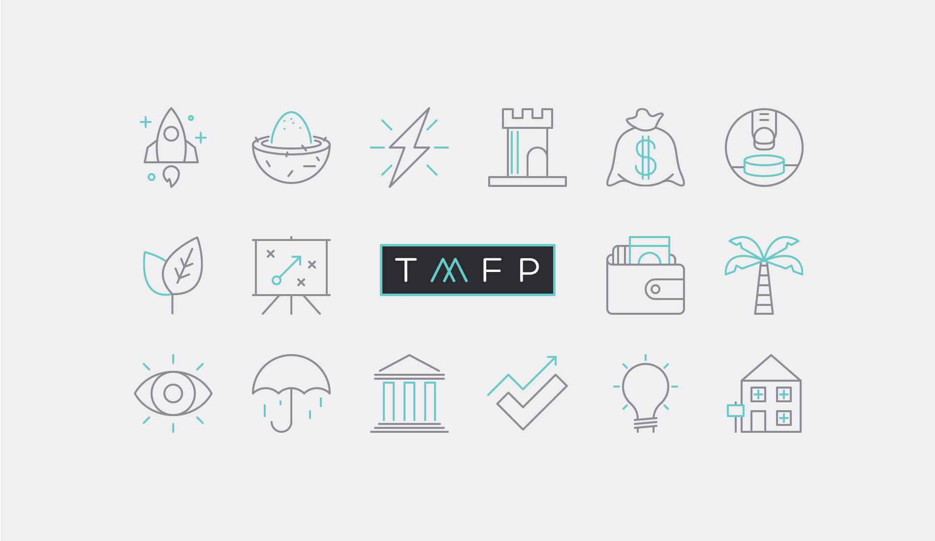
Starting with a complete overhaul of the brand logo, stationery and marketing material we created an identity Taylor Made could be proud of. We then built a beautiful new website site that works hard to channel users quickly without bogging them down with irrelevant information.


"Thank you Fhoke for all your help, you have been eternally patient and have added a little sprinkle of creativity to a team of number crunchers. So proud."
Result
We launched a fantastic looking site that speaks to the clients that Taylor Made wants to attract. Subtle CSS animations and super slick navigation sets their website apart from others in the financial sector.


