What we did
Website Design for Lyon Content
A team of rebellious content creators helping lifestyle brands publish the best online content, Lyon shakes sh*t up to dominate a niche. So it was no surprise that the team came knocking; as a specialist WordPress Design Agency, we were their best choice for this website design project.
Launch website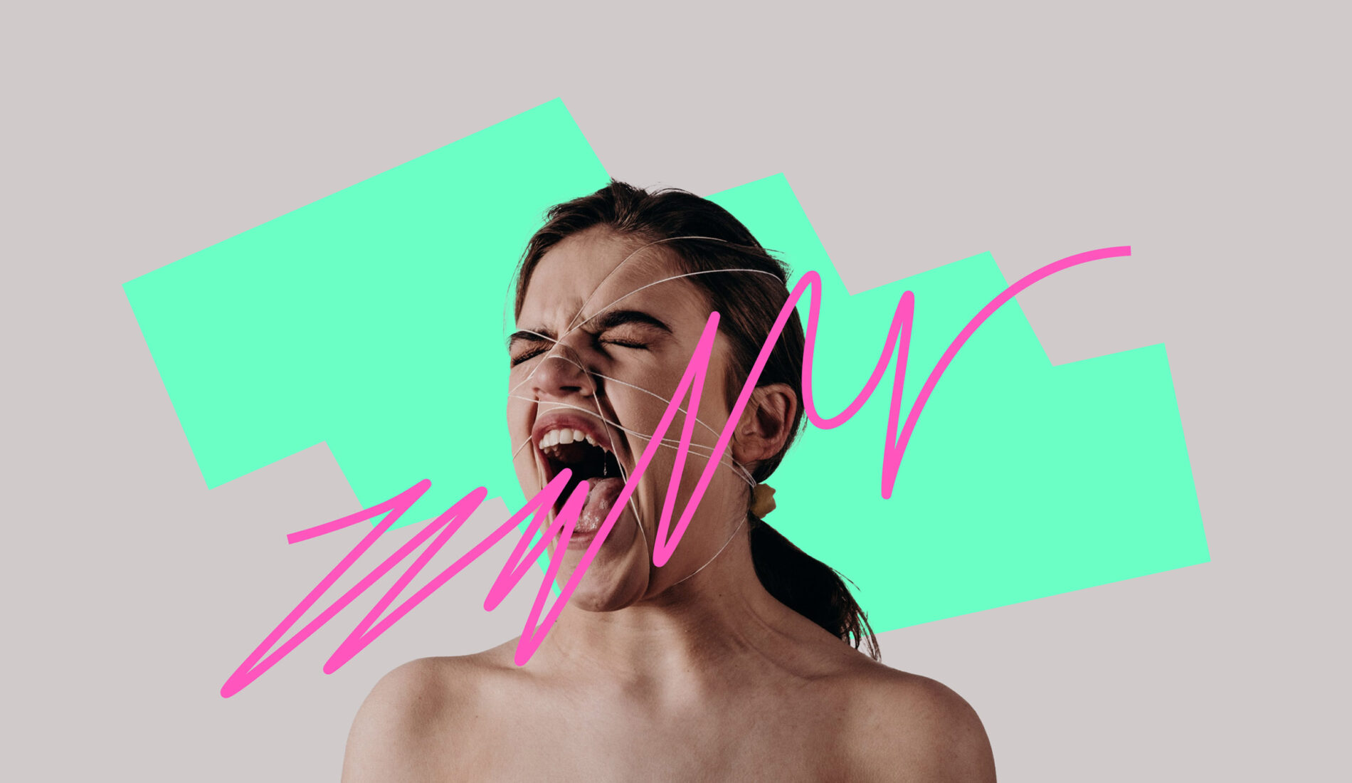
Branding
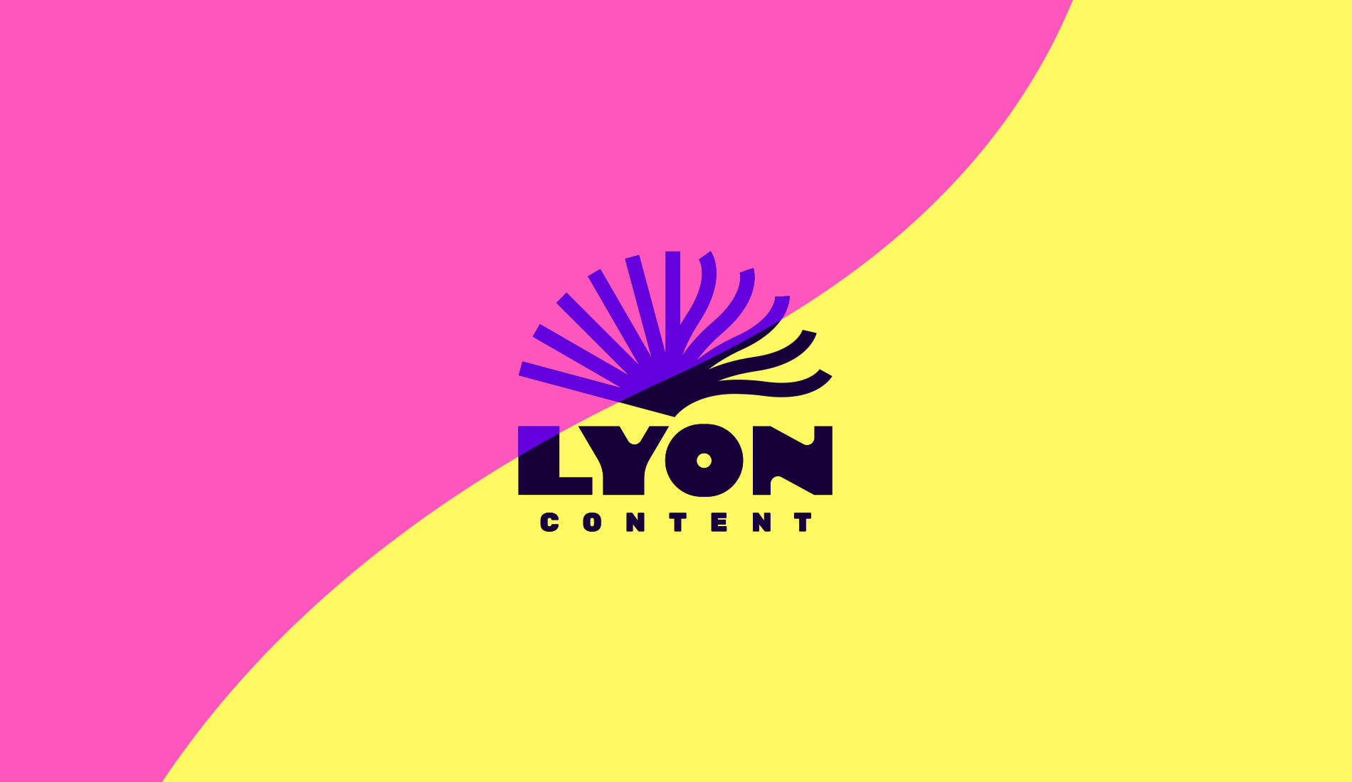
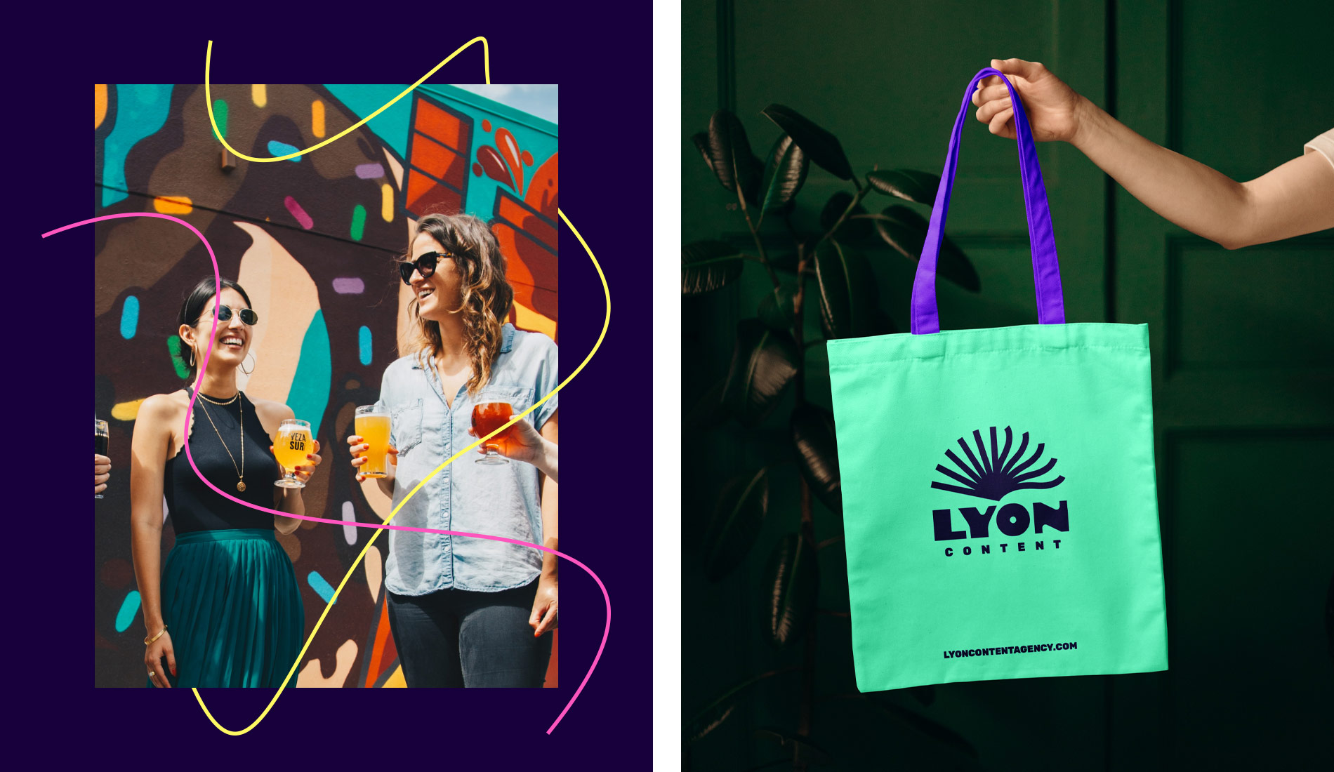
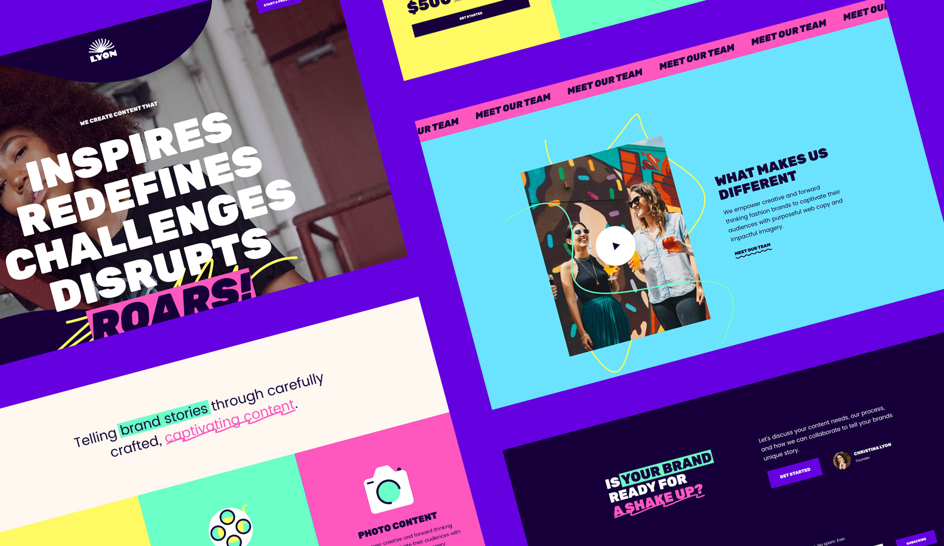
As a new agency, the first stop was to create a brand and identity that reflected the company’s vision. The name was ripe for a playful and striking logo mark, with shapes that contain concepts of a lion mane, pages of content, the sun, fire, water and change. Coupled with a warm, fun and vibrant colour palette, the new identity works brilliantly online to project a bold and confident brand that isn’t afraid to disrupt the market.
Website Design
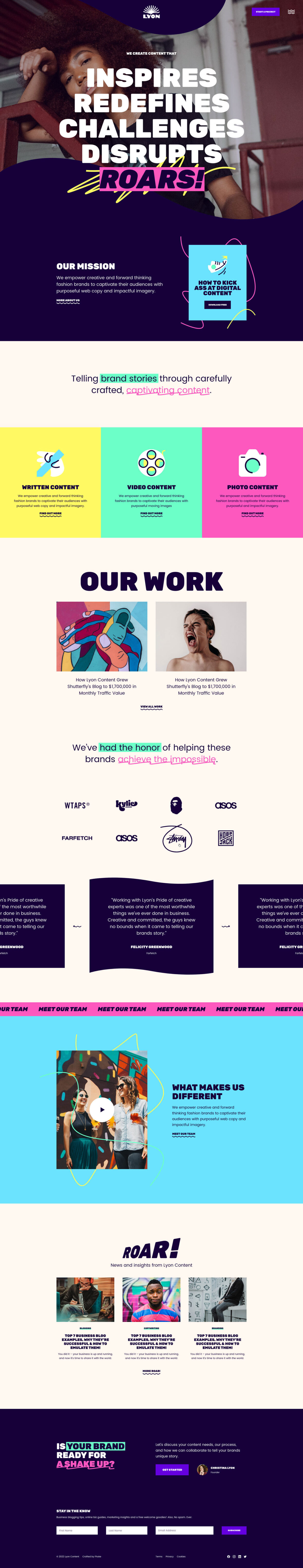
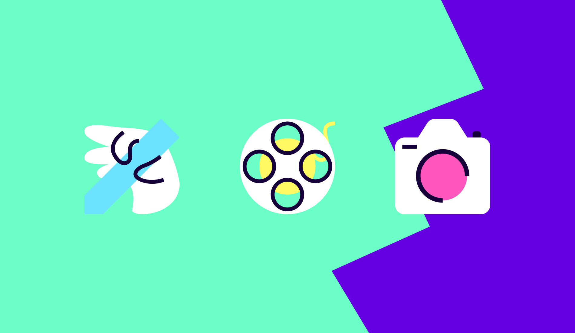
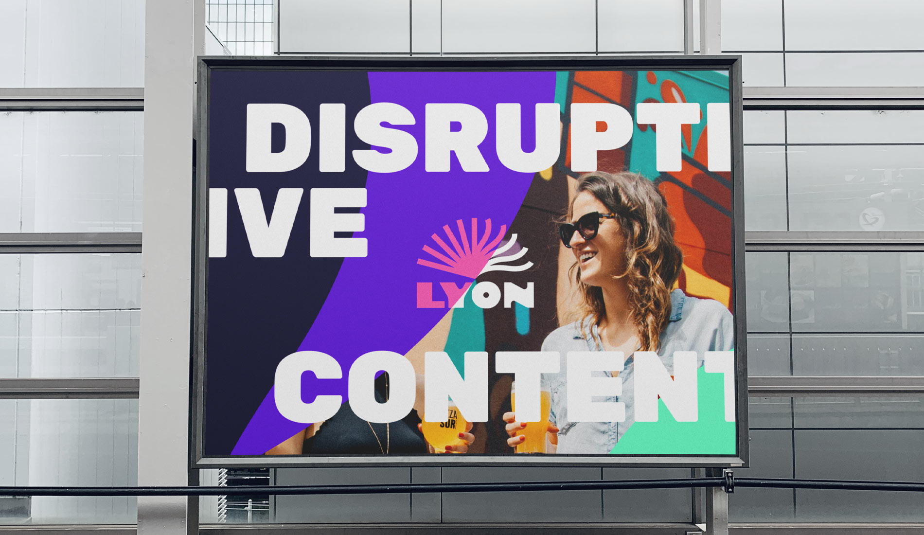
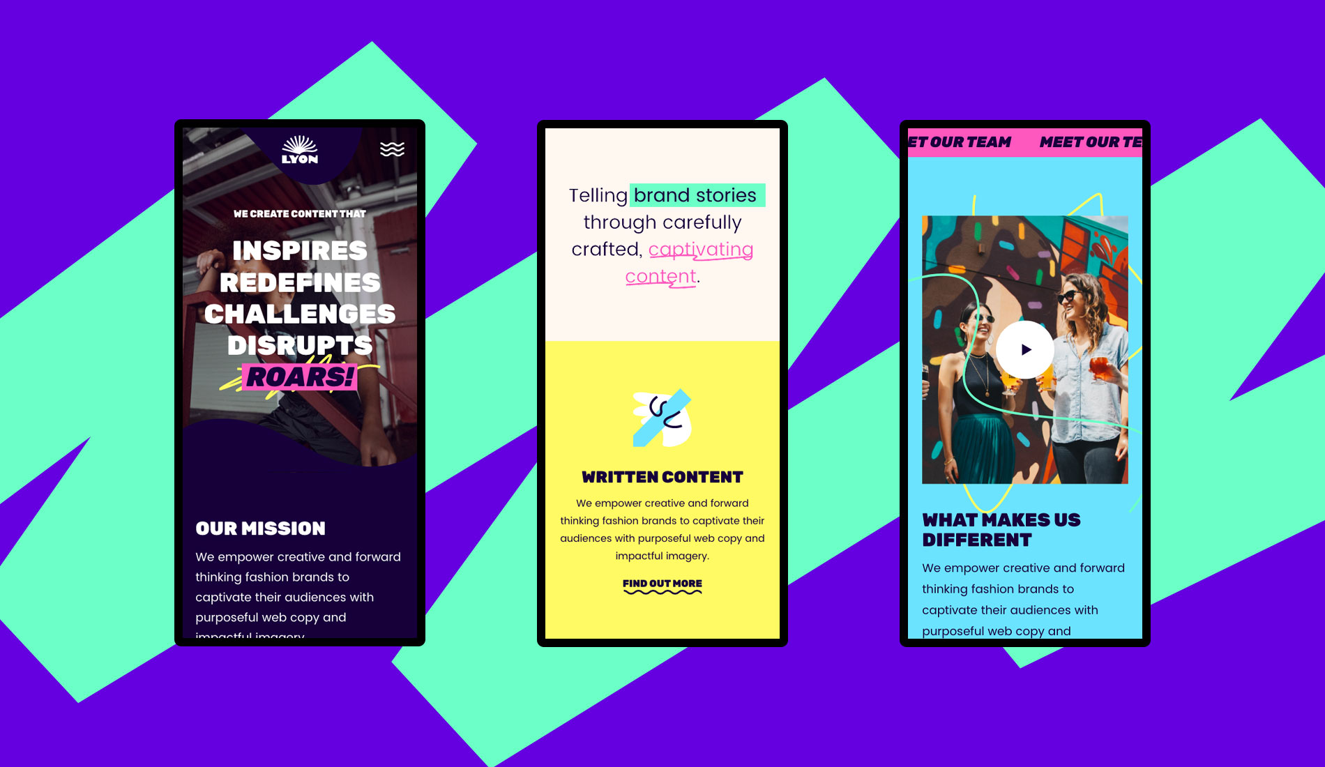
With a blank screen and a new, vibrant brand to play with, we let our imaginations run wild across the new site’s pages. We wanted to create something bold and exciting to set Lyon apart from everyone else’s traditional approach. The bold colours, shapes, and patterns tie the pages together to reflect the rebellious nature of their work, creating an existing and bespoke WordPress theme.
WordPress Development
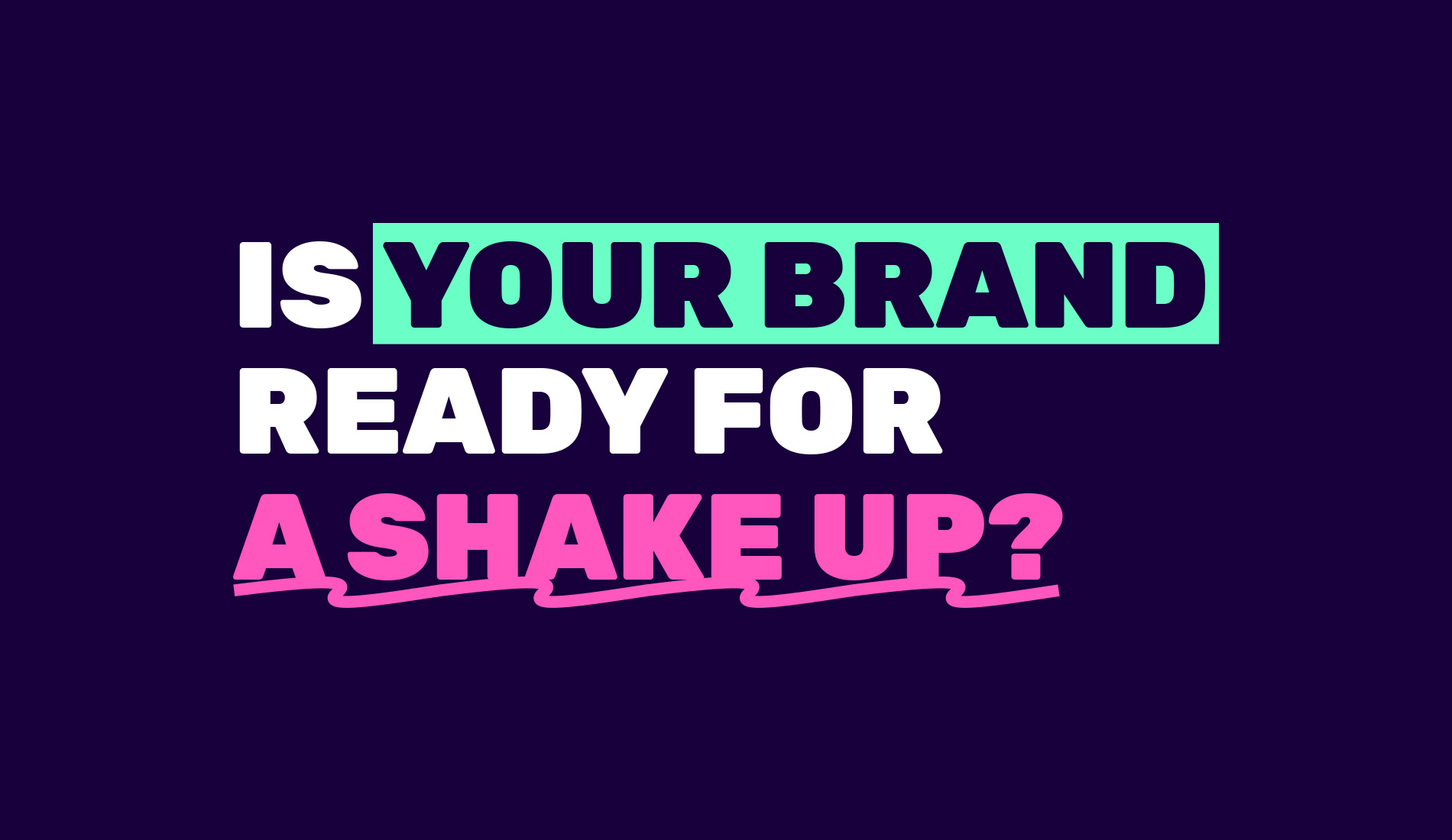
With splashes of neon colours, bold patterns and shapes, we envisioned using playful interactions and animations from the start. These were developed to enhance the content, not overpower it, and coupled with an easy-to-navigate site, potential clients can easily find everything they need before getting in touch. So, WordPress was the natural choice for building this easy-to-manage brochure website that works hard behind the scenes while looking fabulous.
I wanted something completely unique, one-of-a-kind, and fresh. In fact, I asked for Neapolitan with sprinkles on top. The team at Fhoke delivered masterfully! I finally feel like we have the dynamic branding we've always wanted, and I know it's going to generate more high-value leads aligned with our services and niche.
Result
The new branding and website design have allowed the Lyon team to find themselves and project an image they could only have dreamt of. It represents them and their work and will also help them to connect with their clients more effectively, bringing everyone together through the art of creative content.


