The Wow Company, are already known for their alternative approach to accounting. They are the accountant’s agencies love. With a look unlike any other, the existing branding had seen them good since 2012 – and it showed.
What was fresh and different then, had soon become dated five years later. However, Wow weren’t ready to let their unique appearance slip away and so our brief was to retain their fun feel but bring it bang up to date for 2017.
Embracing a brand
We started by evolving the logo. Rather than scrapping it for something new we were able to retain the trust that Wow had built up over ten years of business, by simplifying the look.
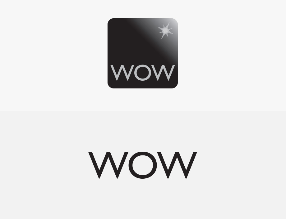
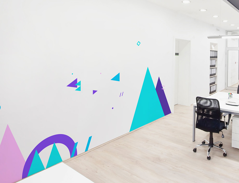
This approach was extended to the brand assets. We fully embraced their logo, taking simple shapes from it to create beautifully simple icons and illustrations. These sit alongside strong, lifestyle photography of the offices and the team to inject the company’s fun and approachable personality throughout their brand. Anyone who visits Wow’s offices or meets the team will see a harmony between the expectations that the new brand sets through the site, presentations, and marketing material and the reality of a face-to-face.
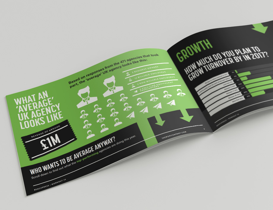
With a strong set of assets from the branding process and design of the site, we were able to take these and create printed media that included stationery and the company’s Annual BenchPress Report – a national agency survey.
We continue to work with the team and are currently working on an online proposal system tailored to each potential client as well as looking at a rebrand to the company’s office space.
Build it and they will come
We position ourselves as a team of designers and developers who are known for delivering brands and websites in style. As a design-led agency, we ensure that every stage of a project involves a level of design that other agencies don’t offer. Whether that’s the design of the site, the way the CMS works, or how the user interacts with the site.
Because we’re focused on beautifully designed, functional sites we rely heavily on WordPress to deliver them. A flexible platform, we can utilise this CMS to give the client full control of their content from navigation, to images, to pages, and text. This is done via the theme mostly and a few selected, high-performing WordPress plugins.
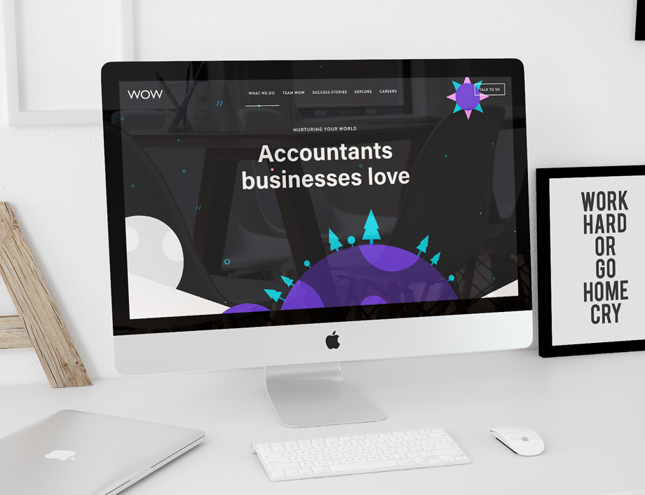
The existing site was built on Concrete 5, another open source CMS. An inferior platform it lacked the ability to develop the site to the expectations of Wow and with almost 25% of the world’s sites built on WordPress, and our expertise, we were a perfect fit.
On the frontend side all of the HTML and CSS for the Wow site is written in a BEM (Block-Element-Modifier) style language, with a few tweaks of our own. All CSS is preprocessed using Sass and is written to be maintainable and reusable. To keep our Sass easily editable down the line by more than one developer, each element of the site has it’s own small Sass file which is then compiled into a single minified CSS file.
All icons and graphics on the site are minified inline SVGs. This is great for keeping the HTTP requests to a minimum while also being able to keep a high-quality for all the various shapes across the site.
To make sure we can always roll-back updates and keep track of what’s happening with the development of the bespoke WordPress theme, the entire site is managed using Git and pushed to a private repository on Bitbucket (our remote repository host of choice).
It’s not all about looks
The existing site was full of great content, but with no structure or hierarchy to the pages, Wow continued to receive calls and requests to explain services that were already described on the site. This took the team time to respond to, but it also underlined that the site’s copy wasn’t performing.
We took a top-down approach and decided that the best action was to strip back as many pages from the site as possible. Some areas went almost four pages deep, so we took the best content from each of these pages and pulled them up to the top landing pages. The large paragraphs of text were broken down into manageable size chunks and signposted with visually appealing illustrations to draw the user’s attention.
Multiple floating landing pages were binned in favour of a few higher performing ones, targeted within areas and businesses Wow actually wanted to focus on.
Although Wow already had an edgy approach to their copy the company as a whole has seen a huge change in the past 18 months, and so the personality of the text had to reflect this. Bolder, fresher, and punchier, the site asks questions rather than making statements, offering a solution to the problems faced by a typical client.
Setting goals and achieving them
As with any new site the goal is always to out perform the old. You can have a great looking new site but if it doesn’t perform then that investment has been wasted.
Before the re-design and build of the new Wow site, the pages lacked optimised title or page descriptions. The site wasn’t mobile friendly and URL extensions where dynamically generated making them unfriendly for search engines.
By introducing Yoast SEO, a WordPress plugin, we were able to tidy up title and page descriptions, and URL’s as well as monitoring a chosen focus keyword within the copy of the page. Not only does it help us to optimise a site it’s a user-friendly tool for clients to understand natural listings going forward.
Every image is also optimised for the site with just the right amount of compression before uploading – without losing too much quality. This process is continued with Smush, a plugin for WordPress that can reduce image sizes by a further 5-10% on upload.
Further optimisation comes from minified CSS and Javascript as well as server side caching.
Since the new site launched in January this year, and comparing it to the same period as last year, there has been a substantial increase in overall performance:
- 45% increase in sessions
- 65% increase in users
- 80% increase in pageviews
- 11% increase in new sessions
- 18% reduction in bounce rate
*This period covers January-May 2016 vs. January-May 2017.
This has been attributed to the cleaner URLs, natural SEO set-up, code, clearer page hierarchy, call to actions, and navigational structure.
The result
The end result is stunning – we are completely in love with it.
What Next?
If you have a brand that needs a refresh, or would simply like to start something new then, please get in touch.
